Showing posts with label 2020Tokyo Olympic celebration.. Show all posts
Saturday, 23 March 2019
Evaluation
Overall, I really enjoyed working on this brief because the outputs are really effective which helps to encourage/reminds the public to watch the Tokyo 2020 Olympic. During the brief, we were struggled about what could we make as a campaign. The redesigned pictograms were the core of the whole campaign because we used it as our starting point to develop our further designs. If I have more time working on this project, I want to try just using rhombus to make all pictograms because I also used some other geometric shapes in this time as some movement/action were really difficult to make, for example, sailing. Hence, if I have extra time, I will try to make them better.
I am happy to work with Sadie, she helped me a lot during the brief. It gave me a great experience to work as a team because I don’t usually work as a team, I mainly just worked independently, therefore, I always feel struggling to work as a team, however, this time was a lot better.
Final Designs
We really like the final outcomes, they worked like a full campaign to celebrate the Tokyo 2020 Olympic coming. Especially the idea of redesign the pictograms with chequered patterns, the output made our works more connected to the Tokyo 2020 Olympic.
London Underground advertisement
Basically, this is just a mock-up to show our campaign to general public. Due to the fact that we think displaying our campaign through the screen AD may works well.
I remembered last year I did a workshop about using "Timeline" in photoshop to make a simple animation, I think it could be really helpful in this project so I used this technique that I have learnt from last year to create a simple animation.
I used "frame animation" because it would be easier to create animation that doesn't has a lot of movement. However, when I showed my first version during the crit, most people said it looks too fast per each frame, it was 0.5 second per each frame. Therefore, I slowed down each frame a litte bit into 1.0 second per each frame.
Idea development
When I considered about which colours to apply to my design, my partner helped me to design a new style of the Olympic rings so that it looks more unique instead of just copying the same Olympic rings. She experimented different "rings" with the Olympic colours, I really like the outcome of the Olympic rings, it looks unique but people can definitely recognize it is the Olympic rings.
Basically, she created the Olympic rings from objects around the studio, she began looking at surroundings and things that could be used as rings. From this she used paint and imprinted some objects of circles, moving to create one using just a paint brush. This method of a single clean sweeping motion reminded her of work she has done previously looking into artists such as Robert Motherwell and ensō. Ensō is a Japanese word meaning circle, it is associated with Zen and Buddhism.
It’s Japanese roots and ideals such as unity and movement connected to it, she thought it would work well for this project. While watercolour paint would provide a smooth outcome that would easily be transferable to digital. Using acrylic paint would have created too much relief from the surface and excess paint that’s wouldn’t be seen in the end product and oil paint would have taken too long to dry. She decided to use watercolour as well to the similar properties it shares within that is most commonly used, but provided more colours she could easily work with. Each circle was painted separately as when painted together the colour would merge and didn’t create the clean look that we wanted to achieve.
I scanned the rings into digitally in order to develop our posters. Simply, I wanted to use it with the Tokyo 2020 Olympic blue so that everything is more connected. Instead of adding too much text on the posters, we decided not to add much text on the posters so that it is straightforward and simple as our main purpose is to tell/ reminds people about the Tokyo 2020 Olympic so not much text is needed.
I was considered about adding the title "Tokyo 2020 Olympic", while, it doesn't look effective on this design. Hence, I looked back to the Tokyo 2020 Olympic logo and I wanted to include chequered patterns design on it.
The result works much better than the previous one, I used "Alte DIN 1451 Mittelschr" on the text "Tokyo 2020" because it is the same as the typeface that they used on their logo. The new designed rings worked really well with the chequered patterns design, it looks contemporary.
Instead of the "rings" poster, I also created some posters that work with those pictograms that I redesigned. Basically, I also used the Tokyo 2020 Olympic blue, while, I also tried to work with five Olympic rings colours. At the first stage, I was unsure whether I should use the text under the pictogram or not. During the crit, some people suggested me to do it, I tried it, however, I personally still prefer not to put text under the pictogram as it looks more effective.
Thursday, 21 March 2019
Initial Ideas
Due to the fact that adults have to work even though in the summer, therefore, they always missed the time to watch the live on tv. Hence, I was thinking to design a simple schedule list for them in order to remind them which date the event is. When I did the research, I found the online schedule on the official website, while I think it is difficult to remember the date that which sports belong to.
Unfortunately, when I worked on the schedule, it wasn't able to finish all because when I finished some and I already know the completed one would be really messy because there are a lot of sports events and all of them takes at least one day. However, as this is the schedule so all content should be included but the fact is the final outcome must be really messy if include all details. Therefore, I gave up this idea of creating a schedule list.
I also tried to make multi colours version of the redesigned pictograms by the Olympic colours, however, it doesn't look good and doesn't match with the whole campaign so I gave this idea up.
Wednesday, 20 March 2019
Colour consideration
Instead of the Tokyo 2020 Olympic blue, we have to think some other colours to work on our designs. Therefore, we wanted to use some colours that is related to Olympic and meaningful. As the result, we decided to try working with the Olympic rings colours because there are five different colours and each represent different areas so we think it would be meaningful to try working on those colours.
At the beginning, I tried to add some gradation on those colours, however, it doesn't look good and effective. While, single tone works the best so we decided to just work with single tone colours.
Tuesday, 19 March 2019
Pictograms redesign
Simply, I looked at different Olympic pictograms as inspiration but mainly focusing on the 2020 Tokyo Olympic pictograms to develop. One that I like the most is the 2008 Beijing Olympic pictograms, it worked really well because the pictograms look like the Chinese calligraphy which displayed a Chinese culture through the pictograms in an international event.
Therefore, I tried to design something based on the chequered patterns and other geometric shapes with the unique blue that used on the Tokyo 2020 Olympic logo.
On the sketches, I used the rhombus as the head because it is the same objects that appeared on the original designs.
The most difficult part to make a decision was whether using the blue with outline only or fill in the whole pictograms. It is true that the one filled in work better because it makes the viewer easier to understand. Hence, I developed my design with this decision.
In a total of 33 sports and some contains more such as aquatics.
Therefore, I tried to design something based on the chequered patterns and other geometric shapes with the unique blue that used on the Tokyo 2020 Olympic logo.
On the sketches, I used the rhombus as the head because it is the same objects that appeared on the original designs.
The most difficult part to make a decision was whether using the blue with outline only or fill in the whole pictograms. It is true that the one filled in work better because it makes the viewer easier to understand. Hence, I developed my design with this decision.
Thursday, 14 March 2019
Olympic pictograms
Each sport has its own pictogram to represent them, the pictograms are aimed at helping to communicate the sports visually to an international group of athletes and spectators. It is claimed they will prove key in aiding the experience of athletes and spectators during the Games.
Each Olympic pictograms are actually very similar including the 2020 Tokyo Olympic. Therefore, I think it would be better to redesign them in order to make it more unique. The official website just released the pictograms a few days ago. However, I personally found that there is a no different or unique point on it, it just like duplicate the previous pictograms and modify a little bit.
In order to make it more connected and more unique, I looked at the 2020 Tokyo Olympic logo and tried to get some inspiration. Since the 2020Tokyo Olympic logo used chequered patterns as the main theme, hence, I think it would be really interesting and meaningful if we can redesign the Olympic sports pictograms based on the chequered patterns and geometric shapes, also it is connected to the logo.
Wednesday, 13 March 2019
2020 Tokyo Olympic logo
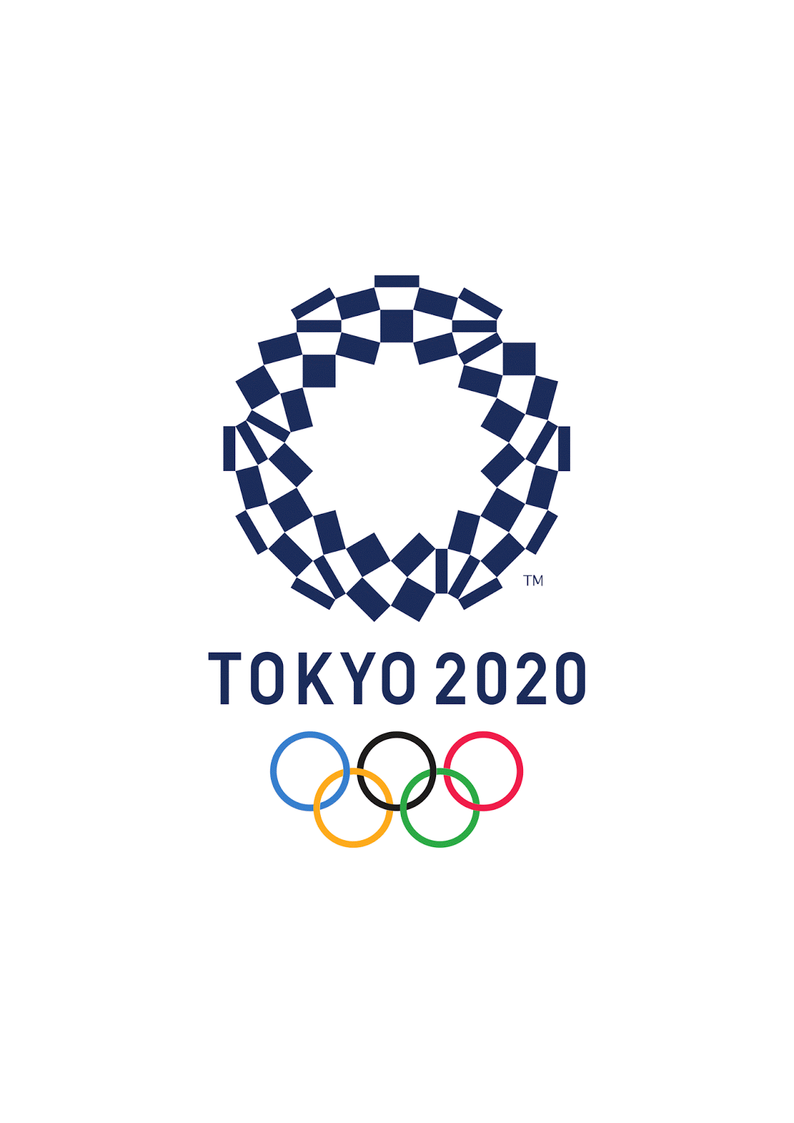
Chequered patterns have been popular in many countries around the world throughout history. In Japan, the chequered pattern became formally known as “ichimatsu moyo” in the Edo period (1603-1867), and this chequered design in the traditional Japanese colour of indigo blue expresses a refined elegance and sophistication that exemplifies Japan.
Composed of three varieties of rectangular shapes, the design represents different countries, cultures and ways of thinking. It incorporates the message of “unity in diversity”. It also expresses that the Olympic and Paralympic Games seek to promote diversity as a platform to connect the world.
Designer of the Tokyo 2020 emblems:
Asao Tokolo
Profile
Year of birth: 1969
Place of residence: Tokyo
Occupation: Artist
Education: Graduated in Architecture from the Tokyo Zokei University
Current employment: Tokolo.com
Awards and exhibitions
MOT Annual 2010: Neo-Ornamentalism from Japanese Contemporary Art, Museum of Contemporary Art Tokyo
Open Space 2010 and 2011 - InterCommunication Center (ICC), Tokyo
2014 Materializing Exhibition II - Chinretsukan Gallery of the University Art Museum, Tokyo University of the Arts
2016 TOKOLO Asao x Aomori City Archives Exhibition - Aomori Contemporary Art Centre, Aomori Prefecture
Selected Works
2007 - FRP/F town façade pattern, Sendai, Miyagi Prefecture (architect: Hitoshi Abe)
2012 - Façade pattern for the 125th Anniversary of the Education Center, Kogakuin University (architect: Chiba Manabu Architects, design work with Azumi Mitsuboshi, Hachioji, Tokyo)
2015 - BaoBao Issey Miyake bag (Tokolo pattern)
2015 - Low-rise part façade glass pattern for the Dai Nagoya Building, Nagoya, Aichi Prefecture (Architect: Mitsubishi Jisho Sekkei Inc.)
Olympic interlocking ring logo
The original interlocking rings logo was designed by Baron Pierre de Coubertin in 1912. Each of the rings represents the five continents: Africa, Asia, America, Australia and Europe.
The colours aren’t random, either. According to Coubertin, “the six colours [including the flag’s white background] combined in this way reproduce the colours of every country without exception. The blue and yellow of Sweden, the blue and white of Greece, the tricolour flags of France, England, the United States, Germany, Belgium, Italy and Hungary, and the yellow and red of Spain are included, as are the innovative flags of Brazil and Australia, and those of ancient Japan and modern China. This, truly, is an international emblem.”
Then each ring is for each continent on Earth
Blue - Europe
Black - Africa
Red - America
Yellow - Asia
Green - Australia
Olympic Sports
The Olympic Games will feature 33 different sports including:
- Aquatics(e.g swimming)
- Archery
- Athletics(e.g running)
- Badminton
- Baseball/Softball
- Basketball
- Boxing
- Canoe
- Cycling
- Equestrian
- Fencing
- Football
- Golf
- Gymnastics
- Handball
- Hockey
- Judo
- Karate
- Modern Pentathlon( ride, fence, shoot, swim and run )
- Rowing
- Rugby
- Sailing
- Shooting
- Skateboarding
- Sport Climbing
- Surfing
- Table Tennis
- Taekwondo
- Tennis
- Triathlon
- Volleyball
- Weightlifting
- Wrestling
2020 Tokyo Olympic
2020 Tokyo will start on the 24th of July, 2020 and ends on the 9th of August, 2020. Officially known as "the Games of the XXXII Olympiad" (In Japanese 第三十二回オリンピック競技大会). Tokyo was selected as the host city during the 125th IOC Session in Buenos Aires on 7 September 2013.
These Games will mark the return of the Summer Olympics to Tokyo for the first time since 1964, the first city in Asia to host the Olympics twice, and the fourth Olympics overall to be held in Japan, following the 1972 Winter Olympics in Sapporo and the 1998 Winter Olympics in Nagano.
These Games will see the introduction of additional disciplines within several of the Summer Olympics sports, including 3x3 basketball, freestyle BMX and Madison cycling, as well as further mixed events.
The Venue Plan for the Olympic and Paralympic Games Tokyo 2020 consists predominantly of two thematic and operational zones: the "Heritage Zone" which houses several iconic venues used at the Tokyo 1964 Games and further sustains the enduring legacy of Tokyo 1964; and the "Tokyo Bay Zone" which serves as a model for innovative urban development and symbolises the exciting future of the city.
These two zones expand across the city to form an ‘infinity’ symbol with the Athletes' Village positioned at the point where the two zones intersect – at the physical and spiritual heart of the Games. The ‘infinity’ symbol embodies the boundless passion, commitment, and inspiration of the world's elite athletes, the limitless potential of future generations, and the lasting legacy that will be passed on to the people of Tokyo, Japan, and the world.
Brief introduction
As the Tokyo Olympic will hold in 2020, therefore, I want to create a campaign or advertising to help to promote or encourage more people to get in touch with the Olympic matches or even travel to Tokyo and watch the live competition.
I decided to work this brief as an internal collaborative project with one of my friend who is taking fine art at Leeds Art University. Her name is Sadie Pursall. This will be about 2-3 weeks project because we want to produce as much as we can and we will illustrate something so it takes a longer time.
We understand that Olympic only can participate every four years so it is a really special event. Hence, we really want to use our ability to help to promote and encourage people to get in touch and watch it.
Subscribe to:
Posts (Atom)