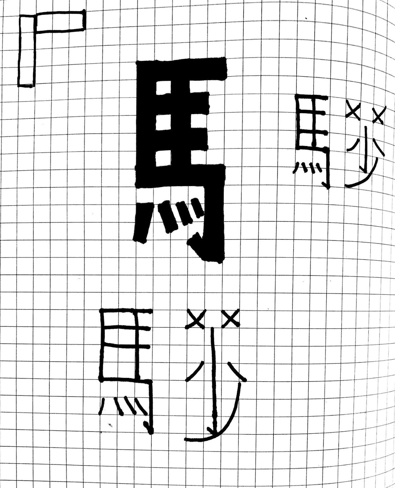
The translated name of "Marks&Spencer" in Cantonese is "馬莎". Due to the fact that the original logo looks really simple with the strokes. Hence, I want to create a new translated logo with a similar style if possible.
I tried a few possibilities that I did in my COP project at the beginning stage before I had any specific ideas (Cursive writing, geometric shapes, and stroke weight). As these three are the most common and useful that I think when writing traditional Chinese characters, people usually modified with.
Simply I worked on a grid paper roughly first so that it would make me easier to write or design the characters. Basically, I tried three possibilities on the translated characters quickly, generally, I think the one worked with geometric shape(rectangle) match with the English logo quite well. Hence, I will development more by this characteristic.


No comments:
Post a Comment