Saturday 21 April 2018

Studio brief2 design board (Colour mode)

  In order to reduce the printing costs, I printed in b&w and here is the coloured version.


Module evaluation

  This module is the extension of Design Practice1 from last year which suppose to be deeper and more challenging. In this brief, I did different research from primary and secondary sources which I didn't do that much as this time before. I think it is harder to collect primary sources because normally, many people may do research with secondary source but primary research has a benefit, the information collected won't be fake because there are many information from the internet may be fake.
  To be honest, I enjoyed work on the first studio brief more than the second one because it is about music which is a really interesting topic to every young age people, however, I know that the second brief contain more marks compared with the first one so I could spend that much time on the first one.
  Generally, I did many crits during this module and it is really useful to my designs no matter the crit was small or big. What I think I should try next time is try to get or collect images in primary sources for example take photo by own as I mainly just used online images all the time, it is not only with this module, it can be any module and even my graphic design practice. Moreover, I think it would be better for me to try to do crits with someone that I don't know or even not in our course so that I can get feedback with more groups of people.

Friday 20 April 2018

Actual outcome (sticker)

  I know that it is not compulsory to produce the actual outcome in this studio brief, however, I think it would be better to present my ideas in a suitable format so I still made the actual outcomes for that. I printed the stickers with the laser cutting printer in the digital print room. This was my first time to work with this printer, it is different with the stickers that I printed before, I don't need to cut it by myself this time, which means the laser printer cut it automatically which is a lot convenient to me. I just know that I have to prepare two layers if I wanted to print like this because the second layer is for how I want the stickers be cut. To be honest this was really funny but the only problems is the printing time is quite long than what I thought.


Thursday 19 April 2018

Actual outcome


  This is my actual outcome, to be honest, I really like it, it likes attractive to me, however, I didn't know why there is a problem when I printed it in double side, therefore, when I cut it, the boundaries were not fit exactly but generally, it still looks like a gaming card. Also, I made some mistake on some cards, the front colour doesn't match with the back side colour but it likes another version of card which is quite funny. I think I should be prepared that printing in double side may occur some problems or difficulties.

Studio brief2 evaluation

  Generally, this brief asked us to do research as much as we can, to be honest, I didn't really have interest at the beginning when I started this brief because it was too hard for me to think about an issue that I want to solve, there are many issue that should be solved nowadays. However, when I had tutorial with my tutor, they chatted with me and gave a lot of useful ideas and examples to me which forced me to think in a better way. Therefore, I came out with an idea about discrimination. Overall, I think the most challenging part in this brief is that the outcomes should be able to help to solve the problem, I was quite shocked at the stage when I just got an idea what issue I would go ahead. Luckily, during one of the crit, someone suggested I could organise an event with that which would be interesting. I was really impressed with this idea because I have never think about that before he told me to do so. I quite like the outcomes but what I think I can do next time is trying just use pictogram in the poster without any word, I never tried this before so I think it would be funny and fresh.

Wednesday 18 April 2018

Studio brief1 evaluation

    To be honest, I really like and enjoyed working on this brief due to the fact that I could produce an object to celebrate a micro-genre of music which I think is really interesting. Moreover, I know that the outcome will be shown in the exhibition so I feel really excited to work on the brief. This was my first time to produce a gaming card, therefore, I feel really impressed with my outcome especially the posters because it looks attractive to me, however, what I think is I could make a packaging for the gaming card if I have enough time to make it. To be honest, I didn't have enough time to make a packaging, I believed that if there is a packaging for the card, it would look a lot better.

Final Outcome


  I made different posters so that I can stick it to different places a round the Leeds university and Leeds Art university which let more students or people to see it.


  This short video is basically a digital poster which will be show in the digital board in Leeds university union and Leeds Art university union.


  During the event, everyone can write down their personal experience to let more people know the how the problem serious.

  I used my personal and my friends experience to created this form and I planed to give it to the participators.


  This is the stickers which I wanted to give to every participators as well, they can keep it or stick it on the laptop or notebook which keep themselves that they should always remember how the impact of this problems is. 


Simple Mock-up


Email invite

  I understand that every student has an email with the university because uni may send some event informations or emergency news to students. Therefore, I think it may also be great to introduce the event to student through a platform that they can easy to see.


  For example, in my university, they also send us an email invite whatever the event is. Hence, I will also make something like it to let or invite more students.

Tuesday 17 April 2018

Animation

  As I know, there is a digital board in the Leeds university union, I think it is a great way to promote my event as there are many students crossing around the union everyday. Therefore, they will see the news. Moreover, it is also a great way to present my event instead of just physical posters, it can save some production costs as well. Hence, I tried to created a few seconds animation. Basically, the video is really simple and straightforward to present the details of the event, the aims is to tell or introduce this event to students in few seconds and trying to get their participation.
 (video)

(Giff)

need to copy the link and paste again to access


  This was my first to make an animation by using frames as I usually used timeline as I think it can produce a better quality of animation, however, the duration of this animate video was really short so it wouldn't be good to make by timeline and it needed to be loop every-time so "frames" is a better choice this time. Moreover, it can't be looped if just saving as mp4 video, the way to do it is to save as giff and open it in the internet.

Monday 16 April 2018

Development

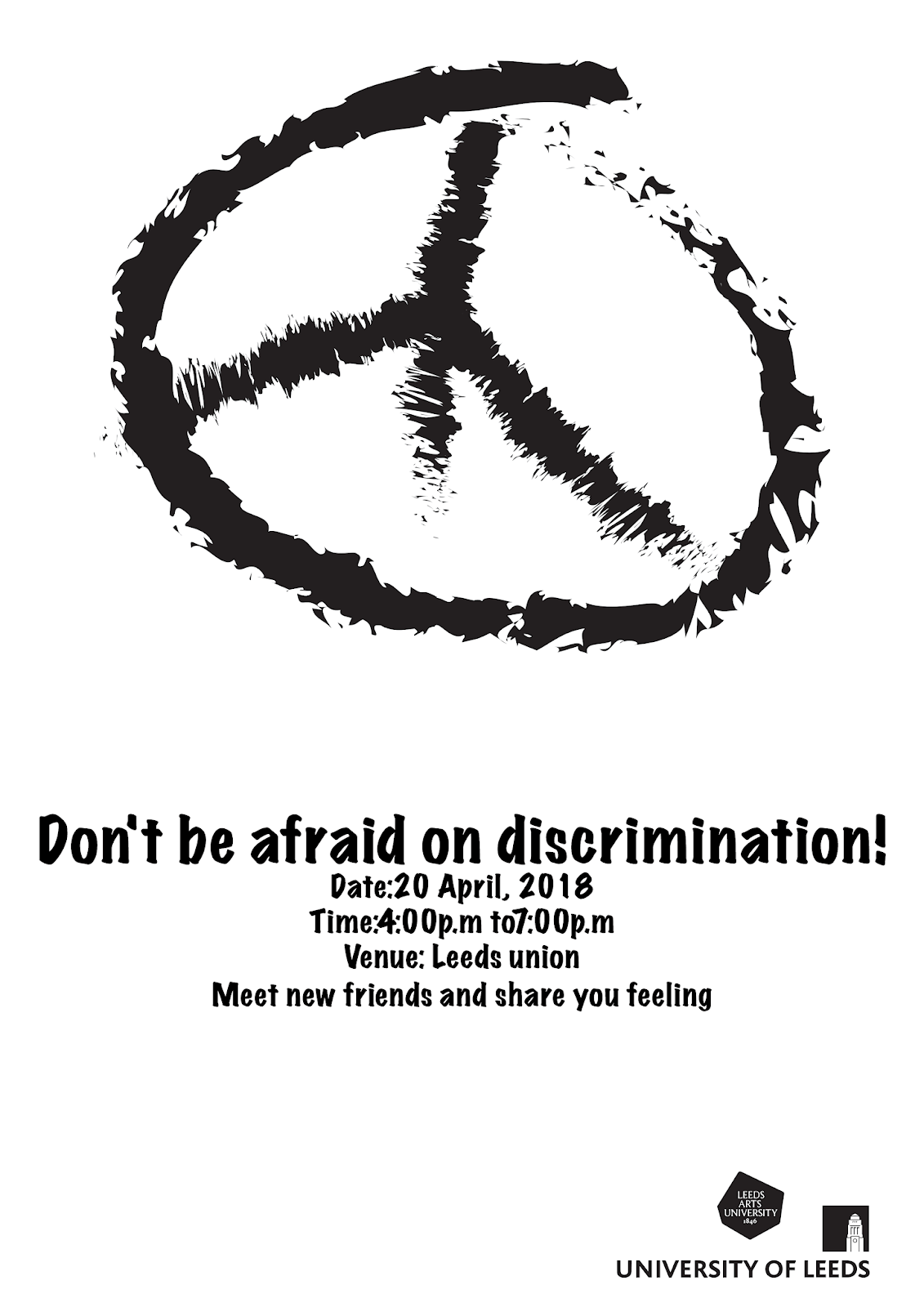
  Basically, there were a number of people suggested that I should working with darker tone as it let viewers feel more serious when they looking at it. Therefore, I mainly worked with black and white only because it is the black is the darkest colour and white can create a strong contrast when using them together.


  Actually, I used different pictograms to represent my ideas even though I don't know if it really works or not but I feel it is a better way to present my ideas rather than just texts. Also, I understand that there is a symbol represents "Peace" and I think it may be suitable for my issue that's why I tried to use it in some of my designs, however, I think it would be better to use a hand-drawing style rather than just trace an image because it seems more personal.


  It was maligned as an anti-Christian symbol (an upside-down broken “Nero-cross”), a satanic character, or even a Naziemblem, the iconic peace sign is apparently not so innocent to everyone.          Thankfully, the symbol has a clear history, and its origin is not so controversial. The modern peace
sign was designed by Gerald Holtom for the British Campaign for Nuclear Disarmament in 1958.   The vertical line in the center represents the flag semaphore signal for the letter D, and the downward lines on either side represent the semaphore signal for the letter N. “N” and “D”, for nuclear disarmament, enclosed in a circle.

  As I collected many informations from my asian friends in Leeds, hence, I made a poster that specifically about the real cases that people discriminated by someone in Leeds before and I planned to show it during the event. The aim of that is to let more people understand the real cases that what discrimination caused. Rather than that, I also designed a simple poster giving to all participators in the event, it is about what they can do if they faced discrimination, basically, it is just a guideline for those people who is the first time faced discrimination.


Font choice(Marker Felt Wide)

  Basically, in my designs, I mainly selected a sans serif typeface which called "Marker Felt Wide", in this typeface, I found a really interesting point, only the lower-case 'u' has a serif.


  The reason for me to selected this typeface was because it seems like marker pen writing which like written by people, if I used it in my designs, it more like first personal, someone being discriminated before, basically, I want it be clear but like hand writing typeface so Marker Felt Wide is really suitable for me. Moreover, I like the bold style of this typeface, I wanted to try another sans serif typeface which is easy and clean to see rather than Helvetica. 

Simple description of Marker Felt Wide:
  Designed by Pat Snyder, art teacher and son of a master sign painter, Marker Felt is exceptional in its combination of casualness with clarity and definition of form. It is particularly useful for giving onscreen presentations to large audiences.

Final design

FRONT 


BACK


  I quite like the final design, it looks simple but seems interesting for me to play this game so I assume for Japanese anime fans may also like this simple card game.

Posters(gift)


  Basically, the poster is like a gift for players if they could finish the matching game on a limited time, it is just a way to make the actual game more fun and interesting. Basically, I just used black and white for the posters as it can save more production costs if printing a lot posters and it still looks good to me.

Final development after a crit

  I did a quick crit with someone in my class and I asked them some opinion about my game cards. As I wasn't really sure about the design for the back of the cards so I asked which one do they prefer the most.

  They suggested me that the one worked with white text was the best one as it looks the simplest and clear, I agreed with that opinion, I think both at the right may looks quite complex if it is for the back side so I will go ahead with the white text one.

Reason of mainly working with black and white

  The reason for me to decide to work only black and white is because I wanted to keep it in simple style, if I working it in colour, it may looks messy. Moreover, if it is for commercial use, black and white can reduce the production costs.

Monday 9 April 2018

Event idea

  Basically, this event is to tell more about Discrimination to students, for example, what is that, what can be done if they faced discrimination, etc. It will take place in University of Leeds Union due to the fact that usually the talk take place in there.
Target: Leeds students
Fee: Free
Purpose: -Introduce the impact of discrimination and what is it
               -Telling people how serious it is
               -A chance to meet more people or friends
               -Share their experience and express their feelings
               -A relaxing environment for people to forget their sad memory
               -Ways to solve the problem
           
Organizer:
University Of Leeds and Leeds Art University

Title of the event: Don't be afraid on discrimination! 

Ways to let more people know about this event:
-Email invite
-Posters in the Union
-Digital board in the Union

Things to produce:
-A series of posters
-Email invite
-Stickers
-Short animation to show in the Union

Rationale of my chosen identified issue

  Basically, I selected "Discrimination in Leeds to Asian student" as my issue as I am one of the Asian in Leeds and I also have many asian friends in Leeds, we faced discrimination in Leeds before which made us quite unhappy and upset. Therefore, I really want this problem to be tackle. Also, I can get the primary and secondary research easily for example my personal and my friends experience, etc. What I planned to do is organise an social event for Leeds students in Leeds university union. Basically, I have to produce a series of posters in physical and digital to introduce to the students to join the event.

What can I use from the information that I collected from my friends

 - Once I collected some information from my friends, I planned to use some data from the survey, for example using the data that my friend's discrimination case as a reference and include it into some of my poster.

- Make a list that what we can do when we see someone discriminated by others and give it during the event.

Idea development

  After the group crit, I have got some new ideas for my issue. I am planning to organise a social event in university union where to display my designs, during the event, people can share their experience and making new friends. Basically, I have to design a series of posters to let people know about this event, for the posters, I am thinking about using my friends and my own experience about discrimination in the posters, may be 4-6 posters. People from the crit didn't suggest me to make the tote bag as they said it may not be useful to helps to reduce the problem as people may just take the bag but not even look at the message. I was really impressed by that so I removed my idea work with tote bag. I think a talk is a really impressive and the most successful way to tell the problem to people.

Survey from my Asian friends who study in Leeds


  I did a survey and asked my friends in Leeds about discrimination. Even though most of them didn't face discrimination before, however, it still have around 40% of my friends faced discrimination in Leeds before which means it is still a serious problem. Generally, my friends who faced discrimination in Leeds faced a really similar problem, mainly young age people shouted at the street and say some bullying things about Asian to them. They said they would help the others if they saw someone who discriminated by others. They think discrimination is a unfair and rude thing, due to the fact of lack education, some people discriminated to others. More than half group from my friends agreed that people in London are more friendly because London is a tourism place where people would be more friendly to foreigners as they may be travellers. Overall, most of them suggested that education can help to reduce and tackle this problem.