Saturday 31 December 2016

Made an A5 booklet with my chosen theme

  As I have a strong interest in Kpop so I choose Kpop as the theme and made my A5 booklet. Before I started to make my booklet, I tried to think what I did well and what I should improve from the previous experience of making the booklet (Pantone booklet). Hence, I kept remind myself I should put the text at the centre this time so that it won't be cutout.
  As I have chosen Kpop as my theme so I did a research about what is Kpop, a full explanation of K-pop is Korean pop music, Upbeat tunes, friendly lyrics and fiendishly catchy hooks are the hallmarks of a K-pop hit. Songs are usually paired with big-budget videos in which perfectly groomed girl or boy bands show off flawless choreography in front of elaborate sets. During Japanese occupation (1910-1945) local and foreign composers created a mix of traditional Korean music and Gospel, that is popular until today and known as “Trot”. Even I love Kpop very much, I didn't know that much about the history of Kpop before I did that research.


  When I started my design, I got an interesting idea, as my theme was about Kpop so most of the things inside the book should be related to Korea. Therefore, I used red and blue which represents the Korea flag. I used Univers LT Std as the basic typeface because it looks simple and thick. As I wanted to design something related to Korea so I used the word "pop" as the started point and I tried to put the Korea map, Korea flag and Korea dollar symbol into the typeface so that it looks more unique. 


  When I started to design the content, I left about 1mm between the boundaries and the group of text so that I could make sure when I print the book it won't be cutout.


  Overall, I think it was very interesting as I could choose any theme that I want and produce a booklet, I really like the outcome especially the word "Kpop" works very well, it showed the relationship between Kpop and Korea. I made the booklet looks a bit different with last time, I made it like a leaflet this time because I wanted to learn more format to make the book.

Friday 30 December 2016

A piece of music that relates to Ping Pong

(Video)

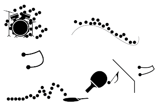
  In my holiday, I found a piece of music that relates to Ping Pong, when I listened to it, I heard a lots of sound of ping pong ball when it hit the racket and table. By the time of repetition and the increase of the speed, I thought it started to be a song, I felt really amazing in the middle of the song.


  Due to this reason, I created these things, I tried to make the ping pong related to music that's why I drew the music note and drums. Also, the reason that I got this idea was because the ball hit the racket so I drew a racket and the ping pong ball which represent the ball hit the racket and the rebound.

10 drawings of your object using a spreadsheet program


  In this task, we have to create 10 drawings of your object using a spreadsheet program, same with the last task, I made the curves, line and different circles to represent the ping pong ball. As this time is using a spreadsheet program, I used the grids as a guide and I typed the "P" into different grids and then formed the text "Ping Pong".

10 pictures of your object in a text-editing program.pages


  In this task, we have to create 10 pictures of our chosen object in a text-editing program.pages, as I choose Ping Pong ball for my object so I drew some circles, curves and lines which represent the direction of the ping pong ball when it hit by the racket or the table.

Thursday 29 December 2016

Chosen object

  In this studio brief, we were given a list of objects and we have to choose either one of them, I choose the Ping Pong ball as my object as I really like to play Ping Pong, I have a large interest to develop an object that I addicted with. Even Ping Pong is only in one shape(circle) but it related with many things such as racket, ping pong table, net, etc. Hence, I can make my design that contain these things.

Monday 12 December 2016

Examples of road signs


  I looked at the road sign systems in different countries, I found that all warning signs are mainly using red and white. It is because Red is widely used to indicate danger (high voltage signs, traffic lights). 

Sunday 11 December 2016

Bike accidents in Leeds

  As my initial ideas are to design a bike wayfinding system in Leeds due to the fact that there is not enough bike signs in Leeds which cause a lot of serious and dangerous problems.


  This is the bike accident map that happened in Leeds since 2005, we can see there were a lot of bike accidents happened in Leeds.


  Also, there was a bike accident happened in Kirkstall Road in Leeds on 15 November 2016 which caused the cyclist died because of the dangerous car driver.The 22-year-old driver of the car, which overturned causing damage to two shops on Kirkstall Road near the Cardigan Fields complex, was rushed to hospital.

  Ten most dangerous Leeds road junctions for cyclists revealed:


 The list reveals the 10 road junctions in the city that saw the most reported cycling accidents between 2005 and 2010.

It says Leeds’s most dangerous junction for bike riders is Roundhay Road-Easterly Road-Harehills Lane in Harehills, which had 23 accidents during the period.
  
The full list of accident hotspots is:

  • Roundhay Road-Easterly Road-Harehills Lane in Harehills (23 accidents)
  • Bridge Road-Abbey Road-Commercial Road-Kirkstall Lane in Kirkstall (17)
  • Harehills Lane-Chapeltown Road-Potternewton Lane-Harrogate Road in Potternewton (16)
  • Bainbrigge Road-Headingley Lane in Headingley (14)
  • Sheepscar Street-Clay Pit Lane-Barrack Road-Chapeltown Road in Sheepscar (13)
  • Headingley Lane-Hyde Park Place in Hyde Park (12)
  • Headingley Lane-Cumberland Road in Headingley (11)
  • The Headrow-Park Lane in Leeds city centre (11)
  • Royal Park Road-Queen’s Road in Hyde Park (9)
  • Kirkstall Road-Burley Wood Mount in Kirkstall (9)
  Hence, there are many bike accidents happen in Leeds.

Monday 5 December 2016

wayfinding rational


  My idea is to design a wayfinding system for Hyde Park in Leeds. For example the things inside the Hyde Park. The reason that I am doing this is because there is not many signs in the park, I think it is very unclear, people won’t know the direction. Also, as there always have many accidents. For example the bike accidents. Therefore, I want to create some signs to tell visitor be careful. I decided to design an objective wayfinding system which people can get the meaning easily. Therefore, I want my wayfinding system is easy to understand and read. Hence, my wayfinding system won’t be over-elaborate.

My sign system can show the direction to visitors easily. I didn’t use that much text in my signs because I think image is easier to understand and remember other than text. My sign system show exactly what the Hyde Park has. If they lost the way, they can see  the signs so that they can find the way.

Evaluation of making the Booklet

  I feel really amazing to work with this task because I can produce our own booklet even it may not looks perfect but it is my first time to design my own booklet. During the task, I learnt many things, such as how Josef Albers use of colour or how colour use in graphic design. I found it is really interesting that just took an image and then I can already make a booklet that using swatches from that image. Actually I think my swatches are quite a sad tone because I think it looks like an “Autumn” tone, those colours aren’t like Yellow, green or Red that kind of “Happy Colours”. I really enjoyed to do this task, I hope I can produce more booklet in the future.


  I feel really safe this time because I almost cut some words so I hope I won't make this mistake again in the future, to prevent this, I can make a "Safe Mark" in illustrator so that I can know which area is safe and which area will be cut. While the colour, I used a gradient tone from light blue to grey which helped to make the book looks better. However, I think I can do better with the layout next time, I put the text to close with the bound so after I print the book, I found it was too close and some of the text may cut out but luckily that it didn't happen this time. Therefore, I should put the group of text at the centre so that it won't be cut out.

                                                 
                                                                                (Video)

  Overall, I quite like the outcome of this book, for the typeface, I used a sans serif type which was Myriad Pro as I wanted the readers read easily due to the fact that it is an A5 booklet so the size is quite small, if I use some serif typeface it may be too difficult to read the details. When I printed the book in the studio's printer, I found that the printed colour is not that good as those in the printing room, however, the reason that I choose to print in that printer was because I could insert my own paper to the studio's printer, I can't do in those printer in the printing room. Therefore, I inserted my own paper and printed from that printer.

Six Klein Blue examples


  The cover for “Fathom architects”. It used Klein Blue as it's all about depth of thinking, so the name idea. Klein blue is a twist on depth of the sea and good old fashioned architects blue-prints. Blue was 
a real gift to the concept.


  This is the logo of Pepsi in 1973. Even the logo just used few Klein Blue but I can feel happy when I see the logo as it mixed with different colours that looks really happy and Pepsi is a cola drink company so if customers feel happy they may buy the drink.


  Visual identity and website for Studio By Night / Victor Vieillard, light conception studio and set designer artist.


  This is a logo of badminton. I really like the idea that using Blue and Red as they are the Primary Colours, putting them together, I think can create a contrast easily.


The Flag of Europe, I think the Klein Blue used in the flag is really good as it looks very peaceful and it represents the sky, when I look at the flag, I feel peaceful, there is no war in the world anymore.


  This is the logo of SAMSUNG. Actually I am not really sure about if this is exactly Klein Blue or not as it looks a bit darker  than Klein Blue. I think even this logo is quite simple but it already let me think the brand is trustful because by using “Klein Blue” in here, I can feel the company is professional.

Initial ideas for my wayfinding system

  I have two initial ideas for my wayfinding project

  1.  A wayfinding system for a park/ bicycle park- Hyde Park
  2.  A bike wayfinding system on the road/street
  Reason of doing that:
  Due to the fact that there is lack of bicycle signs in Leeds, when I walk in the street or park, I couldn't see enough bike signs, there is only a sign telling the cyclists that which road they can ride the bike, there is no sign reminding the cyclists the speed, people, etc. Hence, I want to design a wayfining system which specially for cyclists.

Sunday 4 December 2016

How to make a booklet

  As I have no ideas about how to make a booklet at the beginning and it was my first time to make a small booklet so I found some information about hot to make a booklet from the internet. I found a useful website to bind a booklet.
http://www.creativebloq.com/indesign/bind-your-own-books-5132651

  Basically, we need to set up our book's page template in InDesign as a new document. The page size, columns and margins will depend on our preference, but the main point is to add an extra 10mm to the inside margin and a 3mm bleed. After that we need to export the file as a PDF and print the page into double side. When the pages are printed out, we need to draw a line from the top to the bottom of the page, 5mm in from the spine, it is where the pages will be stitched. Along that line, mark a dot 10mm from the top and one 10mm from the bottom, then put some dots in between these. And then we can just start stitching and glue the spine.


  However, I thought binding a book may be a bit difficult for me at that time as I have no knowledge about how to make a book so I just wanted to keep it simple. I looked at the simplest technique of making a booklet.


  Basically, we just need to fold the A4 paper into half(A5 X2) and then just use a stapler to staple the pages together, it is the simplest way but can produce a good quality of booklet so I decided to make my booklet like this. 

Friday 2 December 2016

Blackletter(Study task 3)

  In this lesson, we used different materials to create a set of pictograms and a signage system for a hospital that uses blackletter typefaces. In this task, we weren't focus if the outcome is pretty or not, we have to focus on the "Time". Also, I cut some outcome into different pieces and replace them to form a pictograms and signs, the quality is quite good.


  In this task, I mainly used different size of brushes, ink, black marker or roll, etc. I added some water into the ink so that it won't be too dry.


  At the beginning, I couldn't control brushes very well so some of the pictograms and a signs were quite bad such as some of them were too thick. However, after I did for a time, I was able to use brushes well. As I did some research about Blackletter before, I know that one of the style of Blackletter is the elaborate swirls, so I tried to do this with my signs as well.


  After that, I cut it into different pieces and replace and stick it again. At the beginning, I didn't have much ideas, so I just cut them without any ideas, however, when I replaced them and tried to see how they look like, I got some ideas. I tried to do some "arrows" signs, "visitors signs" and "information signs". I think cut them into different pieces and stick again is very fun because it looks very attractive so if it use as a sign, people can focus and understand it easily.


  In order to make my pictograms and signs to digital, I started with black and white. As a good pictogram or sign system should be easy to read so I made them very easy to understand. To test if it works or not, I asked my friends if they can guess the meaning before I told them. The result show that most of my signs are easy to understand.

Thursday 1 December 2016

Sign systems in Leeds


  I found many sign system examples in Leeds. For example, I found some toilet, food court, fire exit, escalator and fire signs. All of them are really simple and easy to understand.

Wednesday 30 November 2016

The use of colour in graphic design


  This book is all about colour in graphics, I found it is very related to this task, it talks a lot theory of colour in graphic design, I read some pages that is related to the task.
  To begin with, it is believed that the array of colours, images and languages that surround us is very large that we keep discovering new meanings to everything that we see everyday. The colour that make people feel unforgettable are natural colours such as sky blue or olive green as they are considered to be common or universal facts which mean they can be change according to the cultural, geographical and historical beliefs. Hence, in the graphic design industry, colour play an important role as it is the major part in the correct reflection of a brand.Also, colour can influence the decisions that you make or the decisions you don’t make. No matter the brand is small or big, colour will not judge based on how much cash you have to start.
  According to the way that our natural senses function, colour is the most influential, after that are Shapes, Symbols, and finally Words. Colour can make a company succeed faster or make bad companies fail faster, for example if a restaurant's logo use a lot of dark black, customers may think the restaurant is dirty and don't want to go. Other than that, if there is too many colours in the design, it can cause people feel messy and not have a sense of direction. Just applying few colours may even better than adding too many colours. Therefore, we can see most branding just have few colours in their designs.


  As I said before, colour change from culture to culture and the impact that a brand has their target audience so each colour has their own meaning. Therefore, the brand need to understand the meaning before apply to the design. Hue is the primary value of a colour and Saturation of a colour is the overall strength or brightness of the colour, while, Value is the lightness or darkness of overall colours schemes.
  I did a research on some popular chosen colours for the branding designs.

  • Red – Action, adventure, aggressiveness, love, and strength.
  • Blue – Trustworthy, confident, calmness, success, dignity, and security.
  • Green – Health, wealth, luxury, nature, and tranquility.
  • Yellow – Attention, caution, curiosity, happiness, and positivity.
  • Orange – Affordability, drive, energy, youthfulness, and enthusiasm.
  • Pink – Femininity, gentleness, gratitude, romance, and appreciation.
  • Black – Simplicity, mystery, and tradition.
  I think it is common for restaurant to apply Green in their designs as it means health which can help to attract more customers.


  These two logo is the example of restaurant that mainly using green (Starbucks and  Subway). They also used other colours but not too many.


  Another example, they mainly used red and yellow as red mean love and yellow represent happiness. When I think of love and happiness, I can imagine candy because when we eat candy we will feel very happy and sweet.

  Just looking at these examples, it already show how important for a brand to choose colours for their designs. Therefore, colour is really important in graphic design, if a brand choose a wrong colour, it must fail or close very quick. For example, if I need to design the layout for a book or poster, etc, I won't use black or dark colour for my font if the background is already in a dark tone, otherwise people won't be able to read the words.

Tuesday 29 November 2016

RGB and CMYK


  RGB is a system that represent the colours to be used on a computer display by using Red, Green and Blue. It can be combined in various proportions to obtain any colour in the visible spectrum. The level of R, G and B can each range from 0 to 100 percent of strength. Meanwhile, based on the RGB knowledge, When combined, red and green light rays create yellow, blue and green make cyan, red and blue produce magenta. Red, green and blue mix to create white (light).


  CMYK is considered as the "upside-down"version of the RGB". However, RGB is mainly for computer displays, while CMYK is used for printed colour illustrations (hard copy- printed paper). C stands for cyan, M stands for magenta, Y stands for Yellow and K stands for Key. In the print industry, cyan, magenta, yellow and black are used as the primary colours, when mixing all colours, it becomes grey. 

Pantone


  The first picture is the location that I choose for this project, the reason that I choose this location is because this is the place where I live, it is a street in Leeds that call "Springfield Mount" and I selected a part to focus.
  I found ten swatches from this image. Just looking at the sky from the image, I found different "Blue"such as White blue or Milky blue. After that, I looked at the building, I found brown red, dark grey and beige(from the windows). At last, I looked at the ground, I found a range of grey and some brown colour.
  After I picked different swatches, I found that it was very amusing because by just focusing a part from an image, can already find some totally different colours such as beige and dark grey, the brightness are totally different. Therefore, I arrange them from brightness to darkness to create a gradation. I believe it would look interesting if the book is in a gradation tone. 

Klein Blue


  Klein Blue is a deep blue hue that mixed by a French artist Yves Klein. The letter "IKB" represent International Klein Blue. Klein started to make monochromes  in 1947, it results attaining the creative freedom. In the early time, the works have an uneven surface, later on, such as the present work, are finer and more uniform in texture. 
  Klein suggested that this colour had a quality close to pure space and he believed it is related with immaterial values over what can be seen or touched. In 1957, Klein said that IKB could be maximised which could  create a rich velvety texture and an unusual appearance of depth. In the same year of his exhibition in Milan, he displayed 11 very similar blue monochromes and he said "Each blue world of each painting, although the same blue and treated in the same way, presented a completely different essence and atmosphere.". Hence, even we may see a lot of colours that very similar or even look like the same, however, it doesn't, it can create something that totally different.
  

  Nowadays, not only tradition methods can create Klein Blue, IKB has been digitalise, we can apply IKB in digitally. We can make IKB in different software by entering their RGB or CMYK values. For the RGB, "Red" is 0, "Green" is 47 and "Blue" is 167. It results "Hue" is 223, "Saturation" is 100, while "Brightness" is 65. For the CMYK, "Cyan" is 100, "Magenta" is 90, "Yellow"is 0 and "Black" is 0. By entering these values, we can easily to apply IKB to our digital designs.

Study task 2 (Make my designs digitally)


  After I scanned my sketches into my laptop, I traced it to illustrator and then made more details to some designs for example adding different colours to it or duplicated and replaced them. Actually, I really like the idea that cutting letterforms and replace them to form a pictogram as it looks the simplest and easiest to understand.


  And then, I did a simple mock-up to display my designs on a wall in a street in Leeds.


  As you can see it looks similar with graffiti for the first one so I tried to make it simpler which is the second one (mainly worked with black). However, I like the first one more as it looks more attractive. Also, on the floor, there has some arrows that I made with the letter "Q" (cut and replace).
  
  In the third mock-up, I just mainly put the "Beauty" pictograms on the wall which is totally different with the first two. 

Monday 28 November 2016

Study task 2 (Objective Symbols of Subjective Things)

  In this task, we were asked to use only shape and colour, apply our developing understanding of pictograms and symbols to develop a series of visual symbols to effectively give the subjective the appearance of the objective. First of all, I choose three adjectives to work on which are EcstasyBeauty and Sensuous.


  And then I searched the meaning of these words as I want to try to see if there have any inspiration for me to design the pictogram for these words. After that, I got some ideas, for example, "make up" items can represent Beauty so I drew some make up items to represent the word beauty. Also, drugs can be the best example to fit the word Ecstasy. Moreover, as one of my word I choose is Sensuous so I want to be "attractive" due to the meaning of the word. Hence, I drew some magnet with an eye which trying to represent "attract people's focus".


  These are some examples in this task, I tried to cut from the letter "W" and replace them to form something, also I tried to use continuous line to draw the pictogram. Moreover, I tried to use type to stick some pictogram, however, the output weren't good as I thought.