Saturday, 28 October 2017
Studio brief 01 evaluation
In this studio brief, it was the first time that wasn't work with our original idea, we were asked to swop our ideas to our partner. To be honest, I don't really like to do that because I planned a lot of ideas for my original idea at the begging. However, I understand that in our future we have to do the same so this brief is helping us to get some experience of working for a client. During my design development, as I have lack of producing publication so I felt quite stress to make a booklet, luckily, there were some book binding workshop provided which helped me to enhance my skill of produce a booklet. Moreover, this is my first time using Indesign for my project over my learning journey, I mainly just using Photoshop and Illustrator. Hence, I wanted to use Indesign in this project so that I can feel more confident to use this software along my graphic design practice. I think Indesign is more difficult than Photoshop and Illustrator, some short key are even different with the other programme so I felt really complicated using it at the beginning but I am feeling more confident to use Indesign now. For the physical publication, I think it works quite well and fits what I want, however, what I feel a bit disappointed is the paper stock was thicker than what I thought, when I touched this type of paper, I thought it would be easy to fold, however, the result was a bit hard to fold. Therefore, it gave a good experience to me that if I want to make any publication that need to be folded, I should choose paper that is thinner than the one I used this time.
Thursday, 26 October 2017
Final design


This is my final design of my publication, I worked with a thicker paper as in the last crit, most people suggested I could use a thicker paper. However, since I printed my final outcome, the paper stock was thicker than what I expected so it was difficult to make the holder in the "X" shape from the Scotland flag, therefore, I just made a straight and simple style of holder to hold five sections of my publication.
Tuesday, 24 October 2017
Initial/concept ideas for 2studio brief
I have some ideas for my second studio brief, some of it are quite interesting and I really like it.
- Making an app teaching Cantonese for example the handwriting step because most of the Cantonese teaching app nowadays only care about the pronunciation rather than the handwriting step. But the truth is the handwriting is even more important than the pronunciation. Basically the problem for me to make this app is because there are some western people who are learning Cantonese but they found difficult in the writing because it is completely different with English. The app will have some animations which clearly showing how to write the word in the correct step. Also, I am thinking to make a mini game as a quiz for users which is a good way for them to practice, it is the unique point which other similar apps doesn't have.
- My second idea is making a K-pop app, basically users can subscribe their favour idols, if the artist release a new song or album, the app will send them the notification to remind them. Also, the app will send the album download link from iTunes to users, they can buy the songs directly and easily. The reason for me to do this is because I understand fans are really exciting for their favourite idols album, however, if forget the date, the app keeps remind them about the news of the album or song so that they can download it immediately. Moreover, I think most people may just focus on their favourite idol groups so their may not know about the other groups, however, my app is able to let them know more about the other groups.
Final crit of studio brief 01

In my last crit, most people said my idea is interesting and they could read the text easily so it means it fits to my aim of my publication, however, they said the paper that I used was too thin and I should use a thicker paper instead. I totally agree with this opinion because if the paper is too thin, it may break easily and if people open and close the publication for many times, the paper may also break so I should think to use a thicker paper for my final outcome.
Monday, 23 October 2017
Folding development
Once I got my design, I have to think about how I could fold to make my publication, I looked at many examples. Basically, I just want reader can open it very easy so I don't want to make it too difficult to open.
I tried in a really complicated way to make the publication, I tried to fold it in a "X" shape because of the Scotland flag, however, it was completely more difficult than what I thought, I could fold it in a "X" shape but once I opened it I could't close it into the "X" shape so I just leave this idea as you can see how I felt difficult in the video and just be one of my experience.
(video)
I tried another way to fold my publication, I prefer this one more as it is easy to open and close which is suit for my target audiences(lazy people). Moreover, I asked some people from my class which format they prefer more and all of them agreed with the second one is much better, they said the first one is not good. Therefore, I decided to fold my publication in the second way.
Thursday, 19 October 2017
Idea development
Once I communicated with my partner and we agreed that the publication should be small size, so I am think about the size should be smaller than "Foolscap Octavo 8vo" 171mm x 108mm. But probably will fold from an A4 sheet.
What is typesetting?
Typesetting is the digital or physical arrangement of text in the fields of publishing and graphic design. Below introduces this unique art of organising and fine tuning document titles and content.
The typeset process refers to the selection and setting of type for a document. It is sometimes confused with typography, which refers to the type design, because both focus on the visual presentation of text. The typeset process results in text and images carefully being arranged in preparation for printing. This requires editors, typesetters or graphic designers select the most appropriate size and style of every text chain and design element. Although the typeset process may appear simple, it is actually a very technical and time consuming activity.

The typeset process refers to the selection and setting of type for a document. It is sometimes confused with typography, which refers to the type design, because both focus on the visual presentation of text. The typeset process results in text and images carefully being arranged in preparation for printing. This requires editors, typesetters or graphic designers select the most appropriate size and style of every text chain and design element. Although the typeset process may appear simple, it is actually a very technical and time consuming activity.

Tuesday, 17 October 2017
Idea development(Type)
Due to the fact that my aim is to make a publication which looks similar to leaflet and specific for travellers who are lazy to read. Therefore, I want to typeface in the publication be a simple so that they can read easily such as helvetica. I was thinking about using the colour of the Scotland flag. In one of the lecture, tutor reminded me that it may be difficult to read using white as the font text in a blue background so I think I should make the font be bold so that it would be much easier to read even though it is in white, I don't want to make any changes on the font colour because what we can see from the Scotland flag is just blue and white.
I remember we did a lecture about typesetting so I want to apply to my design, I was thinking about arrange the font with the baseline so that it looks more organise. Also, using grid is really important for the layout so I also used it to help with my layout design.


Afterward, I looked at some thing that can represent Scotland. I looked at a typeface calling "Rennie Mackintosh". ITC Rennie Mackintosh font is based on the handwriting and drawings of Scottish designer Charles Rennie Mackintosh, who was widely acclaimed for his highly original buildings, interiors and furniture produced at the turn of the century in Glasgow, Scotland. The ITC Rennie Mackintosh font family includes two weights, bold and light. The bold font design is very close in weight and colour to Mackintosh’s original hand lettering, while the lighter weight was designed to be suitable for use in smaller point sizes. I think it would be very related to what my brief is if I use this typeface in my publication, however, I tried to use this font for my body texts and it looks very complicated and difficult to read. Moreover, I asked some of my friends in my class if thy could see the font in the body texts, unfortunately, they all said it was difficult to read so I just decided to use it for the title of my publication and keep using Helvetica for the body texts because of it simple style.


Rennie Mackintosh
Charles Rennie Mackintosh (7 June 1868 – 10 December 1928) was a Scottish architect, designer, water colourist and artist. His artistic approach had much in common with European Symbolism.


Rennie Mackintosh typeface is quite unique with the other typeface, I think the font is quite abstract, it seems like made by an object. It is quite new to me so I didn't know about this typeface until someone suggested me I could look at some Scottish thing to represent Scotland.

Photos that I selected for my publication
My idea is to choice around 5-6 photos for each section ( in total 5 sections because my partner went to 5 places in Edinburgh).


Monday, 16 October 2017
Materials/ Binding research
Materials: For materials, I am thinking about some thin paper because my idea is to make 5 section of something like leaflet and then it can be folded in a pocket size so that travellers can carry it out easily. The reason that I am not going to make a formal booklet is because it is unconfident


to carry out and people need to flip the pages all the time, while making some leaflets, people can just open once which is similar to a map. Therefore, I am thinking about using some thin paper to make my publication. There are many thin paper that I can consider.
1: Carbon Paper

This is paper with one side covered with solid ink, the eponymous carbon or a similar solid dye. However, I think this type of paper is not suitable for my publication because I am wondering if I print in double side, the ink may be penetrate and it can't be read.
2: Thinner card

I think this is the best choice for my publication because of the thickness is fit to what I want, also as we can see most of the advertising leaflets are using some thinner card because it print well and easy to fold but not easy to break.
Binding method:


I looked at few pages from a book about binding a booklet, due to the fact that my idea is something like a leaflet so I am thinking about "Mock book fold" because it looks quite simple which means is easy to open, as my target audience is for some travellers who are lazy, don't want to flip the pages so I am sure that they want a publication which is easy to open or read.
Target audience
Basically, I am considering the target audience for my publication be the people who want to travel to Edinburgh, however, I think it is too general and I want to make a specific group of target for my publication. So I am thinking if I can focus on some lazy people who don't like to read much text while travelling, it would be quite interesting. I understand that during the travel, people don't really want to read that much text so I just want to keep it as simple as it can.
landmark in Edinburgh
There are many landmarks in Edinburgh, my partner has been to some of it so I want to include those places she has been into the publication as the content. Basically, my idea of the publication is to introduce some places that my partner went to Edinburgh to people which is similar to a travel guide book but more personal. I think it would be quite interesting to include those landmarks where my partner went into the publication. It will be meaningful to include it, to make it more interesting, I am thinking about doing some illustrations.
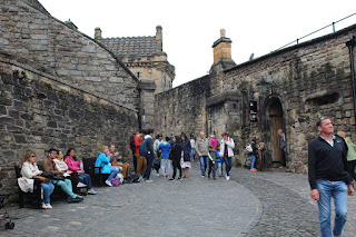
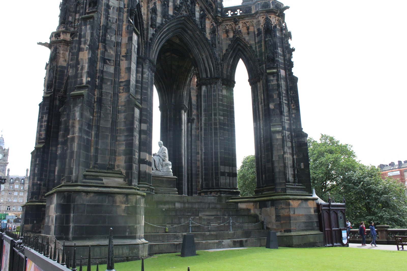
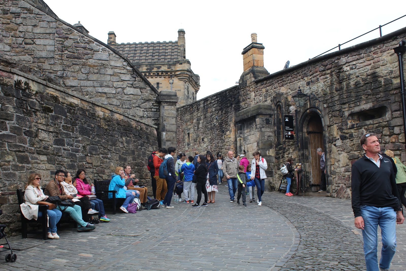
 The most popular landmarks in Edinburgh are Calton Hill, Colinton, Corstorphine, Scottish National Gallery of Modern Art, etc. My partner went to The Castle, National Gallery, Scott Monument and Statues and she went to some places that are really attractive even though it isn't the landmark of Edinburgh. For example, some cafe or museum.


Sketches of the landmark in Edinburgh


Basically, I tried to keep the sketches as simple as I can, however, I wanted people can imagine or know what is the sketches within few second. Therefore, I tried to find the specific part to represent the building and the sketched to my drawings. Luckily, I asked some people from my class if they could get what are the sketches within few seconds and they could tell the correct answers in few seconds.
Subscribe to:
Comments (Atom)