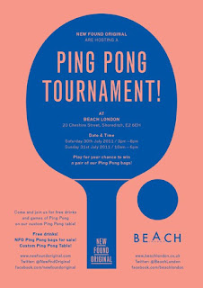
At the beginning, I looked at different examples of sport posters, I wanted to look at how they design, how they used the colours, etc. I found that most examples of posters were just used few colours, may be maximum five colours which I thought is really simple. And then, I looked at their typeface. I didn't know why the style of it seems like to make an empty line on it. For example the Thomas Sport's logo, the style of their typeface is really simple,not even elaborated. If they designed not to have the empty line, they just applied a simple typeface such as Helvetica. The Sport Direct logo is an good example of simple design, it just used two colours in their design (Red and Blue) and the typeface they choose was really simple, however, I think it is a good design because even it looks simple, it still can get people attraction. Therefore, it is a good inspiration for me to develop my design.


No comments:
Post a Comment