Tuesday, 28 February 2017
Concept idea
I decided to make the book cover for the children book which was “The Secret Diary of Adrian Mole Aged 13 3/4”, written by Sue Townsend. The reason that I decided to work with the children book was because I really like book covers having illustrations, it made me feel happy and willing to read the book already. I know that my main problem over my study is I always make things a bit complicated. Therefore, I believed that it would be better for me to design a children book cover rather that the others which I can start to make my designs look simpler.
Sunday, 19 February 2017
Development of my exhibition poster
Due to the fact that the theme of this exhibition is "Space". Also, as the Prix Pictet has become the world’s leading award for photography and sustainability so I wanted to design my poster with less colour which mainly focus on black and white so that it can save more costs and resources. To make the poster looks more attractive, I added a gradient tone from black to white. I decided to use Helvetica Bold Oblique because of it clean style which can let people read the poster easily, the reason that I use the typeface with italic was because the theme of the exhibition is "Space" so I wanted the font be dynamic. Therefore, using the font with italic can make the poster related to space.


However, when I looked through my design, I got an better idea, due to the fact that the aim of the exhibition is to display some photographers photos so it would be great if I used one of their photograph into my poster. Actually, I didn't want to make the poster look complex because in the previous module, the feedback said I always made my designs too complex so I wanted to make the poster look simple this time. Hence, I just put the details of the exhibition into the poster such as venue, time or title. I choose the image "Bangladesh, 2014, from the series Land of Undefined Territory" which took by Wasif Munem because I really like the tone of colour in this photograph, it seems quite old, also I didn't know why when I looked at this image I thought about space because of the road at the middle and we can't see the end point of the road which made me feel related to space. Therefore, I decided to use it as the background of my poster, after that, I modified the colour of the photograph in Photoshop as I thought the original photo was too bright and I wanted to create a contrast with the photograph and the type I used in the poster, I made the photography look darker so that it created an old effect and that's why I used whit for the type rather than saving more costs and resources. Overall, I rally like the outcome, it looks simple, the poster fully showed the relation to space.

 |
| Final poster |

Due to the fact that I am not really good at folding paper so I just wanted to keep it simple, I looked at the simplest way to fold to A4 from A1 from the internet. Because an A1 portrait size is 594mm x 841mm which mean it contain 8 landscape a4 size (210mm x 297mm). Therefore the simplest way is to fold the A1 poster into 8 landscape A4.

As we just have to submit digitally so I did a digital mockup of how my poster look alike when folded to A4 size. To be honest, I am not really good at doing digital mockup so this is also an important thing that I should practice and tackle so that it can help me to produce a better and professional quality of works.
 |
| A1 poster folded to A4 |
Thursday, 9 February 2017
Module evolution
In both studio brief, I feel quite happy with the actual outcome because I worked harder compare with last module even it may not looks good but I spent more time on the works which made me feel happy. Especially in the first studio brief, we worked the project through a long time, about three months. We did a lot of study tasks helped to develop our designs, I really enjoyed the time worked on those study tasks. In the first studio brief, the first study task was worked as a small and then went to the city of Leeds and created a short video about our group’s wayfinding system, that was my first time to work as a team for the project in this course, I felt quite excited because that time we couldn’t choose to work with who so I couldn’t work with my friends. Therefore, I felt quite sad at the beginning but when I worked in my team, I thought the idea was very interesting, we used balloons as our wayfinding system so I wasn’t sure if it works or not. However, the result wasn’t bad, I saw many people reacted to that. Hence, it let me started to get interest in the project. It was a great starting point over my first project. And then, the study tasks second and third were even more funny, I remember, when the second task set, many people in our class shocked because we have to design 50 pictograms in a very limited time. Due to this reason, I felt very nervous at the beginning, I wondered if I could finish the task on time but tutors suggested that we could only use few seconds to finish one design. I thought it was a good experience because it could develop my skill that make a design in few seconds and then go on with other designs. Moreover, in the second and third study tasks, I learned a great skill which I can always use in the future. In those two tasks, cutting from letterforms and shapes was the main process that I used to work on both tasks. After I cut from different letterforms and shapes, I replaced them and formed different designs which I thought is quick and good result. Therefore, I also used the same technique to work on my final design in the first studio brief. I found that the letter “I”, “L” and “O” were great for cut and replace because of their simple style. While, in my second studio brief, we got about two weeks to work on that project. However, I didn’t really feel nervous as last time worked on the second study task in the first studio brief, I really enjoyed in this studio brief as we could choose an object from a list and then make any designs. It doesn’t has any limitation so I thought it was a “Free project”. However, both of my studio brief, I worked the designs too complex which made the result not good at the beginning. As I always worried if people could understand the meaning of my designs so I always tried to make the design over elaborate. However, people said it may even looks worse than a simple design. Therefore, that is the biggest problem that I think I have to overcome. Last week, the “BUILD” talk said if the theme is complex, just work very complex, however, if the theme is simple, we should work really simple, we should never work in the middle which mean make the design between over elaborate and simple. I thought I worked like that at the beginning of both projects that’s why I thought that is my main problem which I should improve and develop it.
Studio brief 2 evaluation
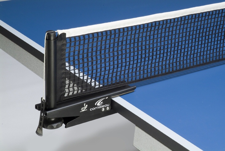
In this studio brief, we just have about two weeks to finish the whole project so the main challenge for me was the time usage. But I thought this was a good chance for us try to design something in a short time. I found it was really interesting to work on this studio brief because we could choose an object from a given list and then developed with it and made different designs. Luckily, Ping Pong was one of the option so I picked that immediately because I really like to play Ping Pong. In this studio brief, I learned a lot of things about Ping Pong that I didn’t know before, especially the history of Ping Pong, I didn't know Ping Pong was called “Flim Flam” so I felt really interesting that I could learn some history about Ping Pong in this project as well. I quite like the actual outcomes, I thought it works quite well. I really like the idea of using line to represent the direction of how’s the ping pong ball going, it was simple but quite meaningful. However, at the beginning of this project, I still worked too complex in my design because I always worried if people could understand the meaning of my posters. Therefore, I put a lots of things that related to Ping Pong. However, the result of that design even looks worse than the simpler design. Therefore, people said my designs look too complex every time in the crits. They always suggested me to work with simpler design and should limit myself, I thought that was my biggest problem in both studio brief which I have to tackle it. Actually, I think the colours that I used in my final design work quite good, it gave contrast to me, however, I made a stupid mistake when I printed the A1 landscape blue poster because I printed the text in Black which was worse than working in White but it still easy to see it. As I had the bookbinding lecture few weeks ago so I wanted to try it and that’s why I made the booklet and leaflet as well, I felt it was really happy because two weeks ago, when I had the bookbinding lecture, I felt it was quite difficult to make a booklet but I was able to make some booklet and leaflet in this project and it doesn’t look bad. Overall, I enjoyed this studio brief so much because I learned and developed lots of things in
this project such as more things about Ping Pong and the bookbinding skill, what I hope in the future is that I should trust myself more because in both studio brief, I worked too complex in my designs because I worried if people could understand my ideas. Hence, I should overcome this problem.
this project such as more things about Ping Pong and the bookbinding skill, what I hope in the future is that I should trust myself more because in both studio brief, I worked too complex in my designs because I worried if people could understand my ideas. Hence, I should overcome this problem.
Studio brief 1 evaluation
In this studio brief, I think it was quite different with last module due to the fact the aims of this module was to focus on the process so we did many study tasks for this studio brief. This was my first time to design a wayfinding system over the foundation year and this course so I felt quite excited and worry at the beginning because I saw many wayfinding system works really well and I was not sure if I could design a wayfinding system like them. However, as we did many study tasks in this studio brief, I was able to understand more things about how to design a wayfinding system, especially the second and third study tasks. I remember in the second study tasks, we have to design 50 pictograms in a limited time, I was really scared in that time as usually worked quite slow but it was really a good experience for me to improve myself. When we worked in digitally, I tried to cut from different letterforms and shapes, it was a good start for my whole project because when I worked with my final designs, I also used the same technique and it works quite well, for example the “Skateboard” or “Bin”signs, I just cut from letterforms and then replaced them to make the final designs. Therefore, I developed a lot from the study tasks. During the group crits, when I showed my designs to my classmates, some of them said I focused on too many theme which would make the project even more difficult, it was really a good opinion because I didn’t know I focused on too many theme before they told me so I understand that from now, I should focus on one theme rather than lots of theme so that I can make a better design. Also, I think I should try to make my designs simpler because some of my designs in this studio brief, I think I made them too complex at the beginning. For example, I used too many colours for the lines at the beginning which made the result of the outcome very complex. However, after the crit, someone suggested me should try to work with fewer colours, I changed the design and it looks simpler but more people prefer it. Hence, this is my main problem in this studio brief that I should improve. Overall, I really enjoyed this studio brief even it was my first time to design a wayfinding system, I learned a great technique which is cut from letterforms, it is quick but works well so I think I can try to use the same technique in the future as the starting point. I quite like the printed map because it looks really clear, it made me feel happy. But what I should prevent next time is not to make my design complex.
Wednesday, 8 February 2017
Actual outcomes


I used the same design with the poster and made six different versions of leaflet which are for all visitors in the exhibition which are free, the content is all things about Ping Pong. If they want better quality, they can buy the one with hard cover which is different design with those six leaflets but the same content.
I printed my posters in 2A1 and 4A2 but I just sticked half of them because I wasn't high enough to stick all of them, I need a stair so that I can stick all of them. I also printed in A4 size as I wanted to see how it looks like. However, I think I did one thing wrong, I shouldn't use black in those posters in green as it couldn't really create contrast even I could still see the lines and text. Therefore, I need to care about this in my future.
Sunday, 5 February 2017
Research for an exhibition of my choice
The exhibition that I choose is "Prix Pictet Exhibition", it takes place in V&A’s Porter Gallery from 6 – 28 May 2017. This exhibition will be free so everyone can go to there without spending any cost. The Prix Pictet is recognised as the world’s leading prize for photography. Hence, there will be a lot of photography show in the exhibition which is suitable for photographer. The theme of this exhibition is "Space".


Basically, Prix Pictet was founded in 2008 by the Pictet Group, the Prix Pictet has become the world’s leading award for photography and sustainability. To date there have been six cycles of the award each of which has highlighted a particular facet of sustainability which contain Water, Earth, Growth, Power, Consumption and Disorder.

Saturday, 4 February 2017
Final designs


These are my final designs for the exhibition poster of the 120 years celebration of Ping Pong. After the last group crit, I found that most people prefer simple design rather than a design with lots of illustrations so I just made them as simple as I can. I designed to make the exhibition take place in V&A museum so throughout my designs, I put the V&A logo. As I have done some research about Ping Pong before. I designed The International Table Tennis Federation (ITTF) as the organiser of this event. I also made a booklet about Ping Pong for the visitors so that they can know more about Ping Pong. Inside these posters, I put those details about the exhibition for example the time, venue, purpose of this exhibition and I also put a name "Film Flam" which is the original name of Ping Pong.
Friday, 3 February 2017
Group crit
When I showed my second design of my posters to my classmates, some of them suggested me to make my designs even simpler as it still looks a bit complex. They proposed to change the typeface to Helvetica as the typeface of my second design was "Snell Roundhand" so the curve of the texts looks complex. They also recommended me to make the lines in same thickness because I just traced those lines from a paper so the thickness may be different. They said I can use the pen tool in Illustrator and draw those lines again so that the thickness can be the same.
Idea development
In the crit, people suggested me to simplify my designs so I changed my designs simpler. I looked some ping pong competition at the beginning and then I sketched the direction of the ping pong ball when it was hit by the racket and the table.


(Video)
I then played a Ping Pong match with one of my friends, we tried to keep hitting the ping pong ball by the racket and the table.


I sketched these lines and then traced them into Illustrator. This time, I worked in Black and White first to make my designs simpler. I removed all figures such as the ping pong player, ping pong racket, etc. I just used those lines with the text of "Ping Pong" and & "120" . I found that these designs are more effective even they look simpler than the first version.

Reason of focusing on the first idea
The reason that I want to focus on the first idea is because most people suggested me to work on the first idea as they think it is more interesting than the others, also, I think that idea is really meaningful as I guess most people like to play Ping Pong but they don't know that it is the 120 years of Ping Pong so I want to introduce this to more people.
First group crit
When I showed my designs to my group, people prefer my first idea which is the exhibition poster of the 120 years Ping Pong celebration as they said I can do a lot of things in this idea compare with the others. They quite like my idea that replace all posters and form like a real ping pong table. However, they said my designs look too complex which may cause confusion. They suggested me try to use less colours so that it looks simpler. Moreover, someone suggested me try to do the background colour half (three posters) in green and half (another three posters) in blue as there are two colours for the ping pong table.
Third idea development
In this idea, I think it is the simplest idea of development as it is quite straightforward but I think it will be quite boring if I just make a booklet about Ping Pong. Therefore, I planned to combine three ideas into one and mainly focus on the first one (An exhibition poster of 120 years celebration of Ping Pong). I think an exhibition should show many information about Ping Pong for the visitors. Hence, I think I should design a small booklet which all visitors can take it from the exhibition venue so that they can know more about Ping Pong.


Second idea development
Actually I think this idea is quite difficult to develop because I wanted to do a musical poster because when the ping pong ball hits the table, the sound will be repeating like a music. In my designs, those “five lines” represent the music note line. However, I think this idea is not really related to Ping Pong and doesn't have much details or examples to look at so I just attempted to develop this idea and I asked opinions from some of my classmates but they said the first idea is better than this one.


I represented the ping pong as the music notes, but I don't really like the output.
First Idea development
When the ping pong ball hits the racket or the table, the ball will rebound to the opponent’s racket and the rebound continues to create a lot of directions.

Ping pong ball and brick wall 1 A ping pong ball bounces straight off a brick wall. Conservation of energy requires the ball to rebound with the same speed it had before the collision, assuming that heating losses are negligible.

Due to this fact, I decided to apply this idea to my posters. At the beginning, I looked at different curves and line patterns.

I wanted to combine the first and the second ideas together because I think when we are playing Ping Pong, the ball will hit the racket or table and creates a lot of sounds. When this is repeating, it sounds like a song or music so I want to put the second idea into the first idea. Hence, I looked at something call "cornelius cardew treatise". Treatise is a musical composition by British composer Cornelius Cardew (1936-1981).Treatise is a graphic musical score comprising 193 pages of lines, symbols, and various geometric or abstract shapes that eschew conventional musical notation.


Since I looked at different examples of treatises to get some ideas. I traced some treatises into Illustrator and made them look simpler and duplicated some of them and replaced them to form a basic outlook of my posters. The reason that I did this is because I think when the ball hits the racket or the table, the direction of the ball is similar to the treatise.
I want to make different versions of posters because I want to make my idea more interesting which mean after I print out the posters I can replace them and then form like a real Ping Pong table. I sketched my idea to a white paper first.


I planned to make six posters instead of four posters because I wanted two of my posters has a landscape outlook. Since I got this idea, I started to work on the real designs. I created six art boards in Illustrator and then use the traced treatise to make my posters.

As this idea is an exhibition of Ping Pong 120 years celebration poster so I put "120" to every single poster. Both of the middle posters, I decided to put the music note line to the bottom and top of the poster because I think the music note line look alike the Ping Pong table net.
Wednesday, 1 February 2017
Three Initial ideas
1) Doing an exhibition poster for the 120 years celebration of Ping Pong.
2) Doing a music poster because when the ping pong ball hit the table, the sound of it will be repeated so it likes a music, in my designs, those “five lines” represent the music note line.
2) Doing a music poster because when the ping pong ball hit the table, the sound of it will be repeated so it likes a music, in my designs, those “five lines” represent the music note line.
(Video)
3) This is really a straightforward idea, doing a booklet introducing Ping Pong for example the history, equipments, rules and basic skills of Ping Pong, trying to encouraging more people to play Ping Pong.
ITTF (International Table Tennis Federation)
The International Table Tennis Federation (ITTF) is the governing body for all international table tennis associations. The role of theITTF includes overseeing rules and regulations and seeking technological improvement for the sport of table tennis. The ITTF is responsible for the organisation of numerous international competitions, including the World Table Tennis Championships that has continued since 1926.
ITTF was founded in 1926, the nine founding members being Austria, Czechoslovakia, Denmark, England, Germany, Hungary, India, Sweden and Wales. The first international tournament was held in January 1926 in Berlin while the first World Table Tennis Championships was held in December 1926 in London.

ITTF was founded in 1926, the nine founding members being Austria, Czechoslovakia, Denmark, England, Germany, Hungary, India, Sweden and Wales. The first international tournament was held in January 1926 in Berlin while the first World Table Tennis Championships was held in December 1926 in London.
Examples of some sport posters


At the beginning, I looked at different examples of sport posters, I wanted to look at how they design, how they used the colours, etc. I found that most examples of posters were just used few colours, may be maximum five colours which I thought is really simple. And then, I looked at their typeface. I didn't know why the style of it seems like to make an empty line on it. For example the Thomas Sport's logo, the style of their typeface is really simple,not even elaborated. If they designed not to have the empty line, they just applied a simple typeface such as Helvetica. The Sport Direct logo is an good example of simple design, it just used two colours in their design (Red and Blue) and the typeface they choose was really simple, however, I think it is a good design because even it looks simple, it still can get people attraction. Therefore, it is a good inspiration for me to develop my design.


Subscribe to:
Comments (Atom)