Tuesday 28 March 2017

Leeds central library room700


  According to the website of Leeds City Council http://www.leeds.gov.uk/leisure/Pages/Room-700.aspx , it said
  "Leeds Central Library’s new multi-use arts space is uniquely positioned on the first floor between the Music and Performing Arts Library and the Art Library. Room 700 is a fantastic space to ‘think, talk, make and do’; with year round events and activities for all ages and interests inspired by the heritage, special collections and books within Leeds Central Library." 

Wednesday 22 March 2017

Design development

  Since I got the idea that I wanted to develop more, I looked at different examples from the internet, I found one example that I really like because of the colour used in the poster works really well. I was think to use red for the words or characters because in Hong Kong, red represents luck and happy during the Lunar New Year, I thought if I used red in my poster, it would be meaningful. Also, as I used bright yellow for my background, it would be easier to see the red. Basically, I wanted viewer to focus on the red so that I decided to use a bright colour for the background just like the example that I found on the internet. To create more contrast, I made the characters have two layers, the back layer, I used black. And red for the front layer so that it creates more contrast when black and red put together. I know that yellow and red can also create a strong contrast so I tried to work with yellow and red, however, the output was really bad, even it created a strong contrast, I didn’t like it so I just kept my first design. The reason that I just applied black for the texts on the lower part of the poster was because I wanted viewers see “2017” and “Happy New Year” at the beginning so that they can know the main purpose of the event in few second. At the bottom, I put four set of number in red, actually these numbers were the past “Year of the Rooster”. Actually, I wasn’t sure if I should put this in my poster or not because it seems useless information, however, I just want to let people know more about the Asian Lunar Zodiac as one of the aim of the event was to introduce the Lunar New Year culture to western people.


Friday 17 March 2017

Initial Ideas


  At the beginning, I wanted to focus on the “Rooster” as it is the main reason to celebrate the event. Hence, I used some lines to draw some pictograms to represent the rooster. As the event happen in 2017 so I drew a “2017” at the bottom which like the legs of the rooster. On the other hand, I tried to sketch a lion dance performance in my sketch ideas of poster, however, I found that it doesn’t related that much with my event and it looks too complex as in last module, many people said I should make my works simpler so my aim in this project was to make the design as simple as I can. Therefore, I looked an Asian designer website to see his works, I look the typography design of his book (left bottom), I really like how he made the words by used different thickness so I got an interesting idea, I made “Happy New Year” in Cantonese. Afterward, I tried to do a similar thing with the book cover but I used triangle shape to form the word. I looked at the structure of the Hong Kong traditional architecture and I tried to use square to make the basic structure of the architecture for the border because the windows of the architecture  mainly used square only. Moreover, I tried to make the
rooster with triangle but I didn’t like the outcome so I just leave it. When I showed my initial ideas of my 5 posters, many people like the one worked with typography, they said it was the most interested and works well so I decided to develop on that idea.


Hong Kong traditional architecture


Digital Initial Ideas:


Inspiration

  I looked at a website of a Taiwanese designer works, I quite like his simple design style, it looks attractive.
http://wangzhihong.com/Project

  The designer is call Wang, Zhi-Hong, he is A leading graphic designer based in Taiwan and a member of Alliance Graphique Internationale (AGI) since 2015. He was born in 1975 in Taipei and graduated from Fu-Hsin Trade and Art School in 1995. Afterward, he started his own studio in 2000 and offering design solutions in fields of publication, art, architecture, film and music.

The major prizes he won: 

  1. Tokyo TDC Annual Awards, Excellent Works. 2009, 2012-2014 & 2017, Japan
  2. Paju Book Award, Best Book Design. 2014, South Korea
  3. Golden Butterfly Award, Golden Award. 2005, 2008-2009 & 2012, Taiwan
  4. HKDA Global Design Awards, Silver Awards. 2011, Hong Kong
  5. HKDA Asia Design Awards, Kaoru Kasai’s Choice Award. 2009, Hong Kong


  I was inspired by this work, it is his hand drawn characters for a book cover design. I really like this design because it used different thickness to form a character which is very interesting so I also want to make something like this in my design, probably using different geometric shapes such as square or triangle.


Sunday 12 March 2017

Studio brief 2 research

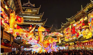
  As I have chosen The Lunar New Year Festival event in Leeds, I did some research about the event and the festival. The event was organised by the Leeds Chinese CommunityAssociation. The aim of the event was to celebrate the Lunar New Year and the Year of the Rooster. It took place on Sunday,
29 January 2017 at Leeds Town Hall. The event begun at 11 am, there were a wide of performance to celebrate the Lunar New Year such as Lion Dance, Lunar New Year food and crafts, etc.


  Lunar New Year is not same as the New Year on the first of January, it is the biggest festival for most Asian. It is commonly called “Lunar New Year” as it is based on the Chinese Lunar Calendar. In Hong Kong, people like to visit to their family and friends, the festival usually begins on the first day of the first month in the Chinese Lunar Calendar and ends on the 15th day.


  There is a story about the Asian Lunar Zodiac. Long time ago, the Jade Emperor which is the Emperor in Heaven, he ordered that animals would be designated as calendar signs and the twelve that arrived first would be selected. At that time, the cat and the rat were good friends and the cat said to the rat that they should arrive early and sign up but the cat usually woke up late so the rat promised that he would wake the cat up as they are good friend. However, on the morning when the rat got up and he didn’t wake the cat up and went directly to the gathering place. On the way, the rat met the tiger, ox, horse, and other animals that ran much faster. In order not to be slower than the other animals, the rat climbed on the ox’s body and let the ox carried him. At last, the ox and him arrived first. The ox thought he would be the first, however, the rat had already slid in front and became the first. Meanwhile, the cat was too late so when the cat finally arrived, the selection was over so the cat hates the rat so much. That's why many people nowadays said when the cat meet the rat, the cat will chase and kill it. The order of the Zodiac is rat, ox, tiger, rabbit, dragon, snake, horse, sheep, monkey, rooster, dog and pig and the year of the animals that represent 2017 is rooster, that’s why we called it 
“Year of the Rooster”.


  Actually, the reason that people like to perform lion dance is because they believe that having a lion grace people. Also, presenting it with red packets filled with money means bring people luck for the rest of the year. In Hong Kong, people like to eat tangerines during Lunar New Year because of the sound of the word in Cantonese is similar to the meaning of “luck”. Therefore, people believe that eating tangerines can bring them luck in the year. Hence, tangerine is the most important symbol during the Lunar New Year in Hong Kong.


Saturday 11 March 2017

The Leeds Chinese Community Association

  The Leeds Chinese Community Association was organised in 1995 as a charitable voluntary organisation.The LCCA is a registered charity (1095420) and incorporated as a limited company by guarantee in 2002 (Reg No. 4429268). The LCCA wholly owns and operates the Chinese Community Centre that provides facilities for social, cultural, recreational and educational activities for people of all ages - children, women, families and the elderly. Basically, over the past 12 years, the LCCA has steadily built a reputation among the Chinese community by providing services, which meet the expressed needs of the community in the areas of health, arts, culture, education, guidance & advice, language skills & support, social welfare and community facilities.

Friday 10 March 2017

Rationale for studio brief 2

  Basically, I want my event in Leeds to be the Lunar New Festival for the 2017 arrival of the year of rooster. The event was organised by "Leeds Chinese Community Association". The reason that I choose this event was because I am from Hong Kong and Lunar New Year is the biggest festival for me and it is really interesting that an Asian event happen in Europe so I think it would be really interesting.

Saturday 4 March 2017

Evaluation of studio brief 1

  I really enjoyed this studio brief because we participated the Student Design Award 2017, this was my first time to participate this kind of competition, I learnt many things from this design award, for example, different style of different types of book, which mean the style of an adult book cover and children book cover is totally different. I looked at the previous winners designs, they were really inspiring. However, due to the fact that this was my first time for me to read the book and I only have a limited time so I couldn’t fully understand the story. The reason that I used black for the text rather than white was because when I used white for the text in my previous design, I could really see the text, also, during the crit, people suggested me that it would be better and easier to see the text if I use black. Hence, I made this decision. I think this project was a great opportunity to improve my skill, I can see others works and learn from others.

final design


  1. - Try to remove the text in the red sock or remove some text in the red sock
  2. - Try a brighter red to apply to the red sock
  3. - Make the background brighter
  4. - Draw the pencil again
  5. - Make the title size larger and make the quote smaller
  6. - Make the  text smaller and make the paragraphs closer together on the back cover  
  Since I listed the things that I want to change after the crit,  I removed all the details from the sock so that it looks even simpler. As someone said I should use a brighter colour for the background and the sock, I used a brighter grey (R:201 G:198 B:197) and red (R:236 G:34 B:39) for it. Due to the fact that someone said that the pencil doesn't look alike a "pencil" in my previous design so I drew it again to make it looks more realistic. I resized the size of the title be larger and the quote be smaller. For the back cover, I changed the font colour to black as it will be easier for people to see the word. Also, I changed the size of the font be smaller and closer with other paragraphs so that the outlook can be better than before.

Friday 3 March 2017

Design development

 This was the design that I worked the most, I made it in a really simple design which just contained three objects from the story, even the glasses only appeared in the TV series but I wanted to put it in my design so that it can attract those people who already watched the TV series, due to the fact that this is the children book, I wanted to make attraction to children so I used three objects from the story (glasses, pencil and red sock) to make them look alike a smile face. I showed this design during the final crit and people gave me feedback, for the front cover, people said the idea that put all the main characters and things from the book to the red sock was really interesting. But someone said I don't really have to put all details into the sock, may be just some of them so that it looks simpler. Moreover, someone said I can try to work with a brighter red so that it looks better. The main problem that I found after I looked at my feedback was the size of the title isn't big enough to prove that it is a title. They suggested that I could make "The funniest book of the year- Daily Mail" smaller than the title as it isn't the title of the book. Back cover- People said the text was too close to the image (glasses) they suggested I could make it into a column. Also they said I should make the pencil look more like a real pencil, I should make a little triangle at the lower part of the pencil to represent graphite. Someone suggested I could even make the text smaller and make the paragraphs closer together. Spine- People suggested that I could make more gap between the text "Sue Townsend" and "The Secret Diary of Adrian Mole Aged 13 3/4". Therefore, I made some changes in my final design to make it looks better, I removed the text in the red sock and applied a brighter red to the red sock. Moreover, to make the reader can see the text easier, I used a brighter grey as my background colour. As someone suggested me to make the pencil better, I drew it again, I cut it into three parts (rubber, body and lead). Also, I made the size of the title larger the quote smaller so that people can focus on the title. Last, I made the text smaller and made the paragraphs closer together on the back cover. The result was better than this one a lot.  

Final crit for Studio brief 01

  In this crit, I showed my final design to my class.
Front cover-  people said the idea that put all the main characters and things from the book to the red sock was really interesting. But someone said I don't really have to put all details into the sock, may be just some of them so that it looks simpler. Moreover, someone said I can try to work with a brighter red so that it looks better. The main problem that I found after I looked at my feedback was the size of the title isn't big enough to prove that it is a title. They suggested that I could make "The funniest book of the year- Daily Mail" smaller than the title as it isn't the title of the book.

Back cover- People said the text was too close to the image (glasses) they suggested I could make it into a column. Also they said I should make the pencil look more like a real pencil, I should make a little triangle at the lower part of the pencil to represent graphite. Someone suggested I could even make the text smaller and make the paragraphs closer together.

Spine- People suggested that I could make more gap between the text "Sue Townsend" and "The Secret Diary of Adrian Mole Aged 13 3/4".

Things to do oven weekend:
- Try to remove the text in the red sock or remove some text in the red sock
- Try a brighter red to apply to the red sock
- Make the background brighter
- Draw the pencil again
- Make the title size larger and make the quote smaller
- Make the  text smaller and make the paragraphs closer together on the back cover  

Wednesday 1 March 2017

Initial ideas

  At the beginning, I sketched some initial ideas of my book cover design, they were all inspired by the previous book cover. Basically, I wanted to pick some main objects from the story and put into the book cover, such as the red sock or a book. As the story begins in the age of 13 3/4 which means almost 14 years old. Hence, I looked at the style of some 14 years old children’s handwriting, most of the handwriting looks messy and curvy. And then I got an interesting idea, wrote directly on the cover so that it looks alike a personal typeface as the book is Adrian’s personal diary, as a result it looks more like a personal diary. Also, as this was my first time to read the book, I didn’t fully understand
about the story but I know about the characters from the book, and I wanted to create a story line so I listed all characters and the relationship between them and Adrian. During the crit, someone suggested me could put into the red sock which would be interesting, so I made a red sock with all the characters and the relationship with Adrian into the red sock, as the story begun in the age when Adrian was 13 3/4 and ended when he was 15, I put both number on the top and at the bottom. Afterward, I made some mock-up with my ideas, I made one of my designs with all handwriting typeface which totally look alike a personal diary but I wasn’t sure if I should put the boy or not. Moreover, in the story, Adrian strongly believes he is an intellectual so I designed the book to put in the cover with some lines which represent the paper of the diary. One mock-up was too similar with the previous book cover so I didn’t really like that, it was the one used glasses in the cover, as I know, the glasses only appeared in the tv series which didn’t appear in the book.


  Basically, I just wanted to keep my design look simple because I always worked too complex in the past and most of the feedback that I got were asked me to work simpler which can even work better than a complex design.

Research for studio brief 1

Book Analysis:
  This was my first time to read this book, in the story, the main character Adrian is about thirteen years old and an incredible worrier. He got lots of problems in that time such as being in love and the relationship between his parents. As this was my first time to read the book so if I fully read the book, it takes me a long time. Hence, I just skim-read the book and the summary, I found that the main plot in the story was Adrian got in trouble because of wearing red socks at school, he did that because he felt rebellious. Therefore, the main object over the book is the red sock.


 Previous book cover analyses:
  I looked at different book covers and the previous winners from the award with the same book, I found a similar point that most book covers have, they mainly used curvy typeface in the book cover.
I thought it was because the target is the children so it would be easier to attract children’s focus as they like more decoration things. Moreover, I found that some covers played with the typography by using ink, for example the top right cover, when I looked at that cover, I thought it was really interesting that the type used for the title was played with ink like the letter “D” or “M” so I thought this was really interesting and inspired me. Basically, the covers of this book were quite simple even it is a children book so I did my cover quite simple as well.