Sunday 14 April 2019

Module evaluation

Over this module, I think it is really free because we can choose any brief that can be beneficial to our future career. I really enjoyed working on all the briefs in this module, especially on those client briefs, I believe these briefs are very helpful to my future career because I can learn a lot of new things during the exercise so that I can enhance myself to become a good and professional designer.

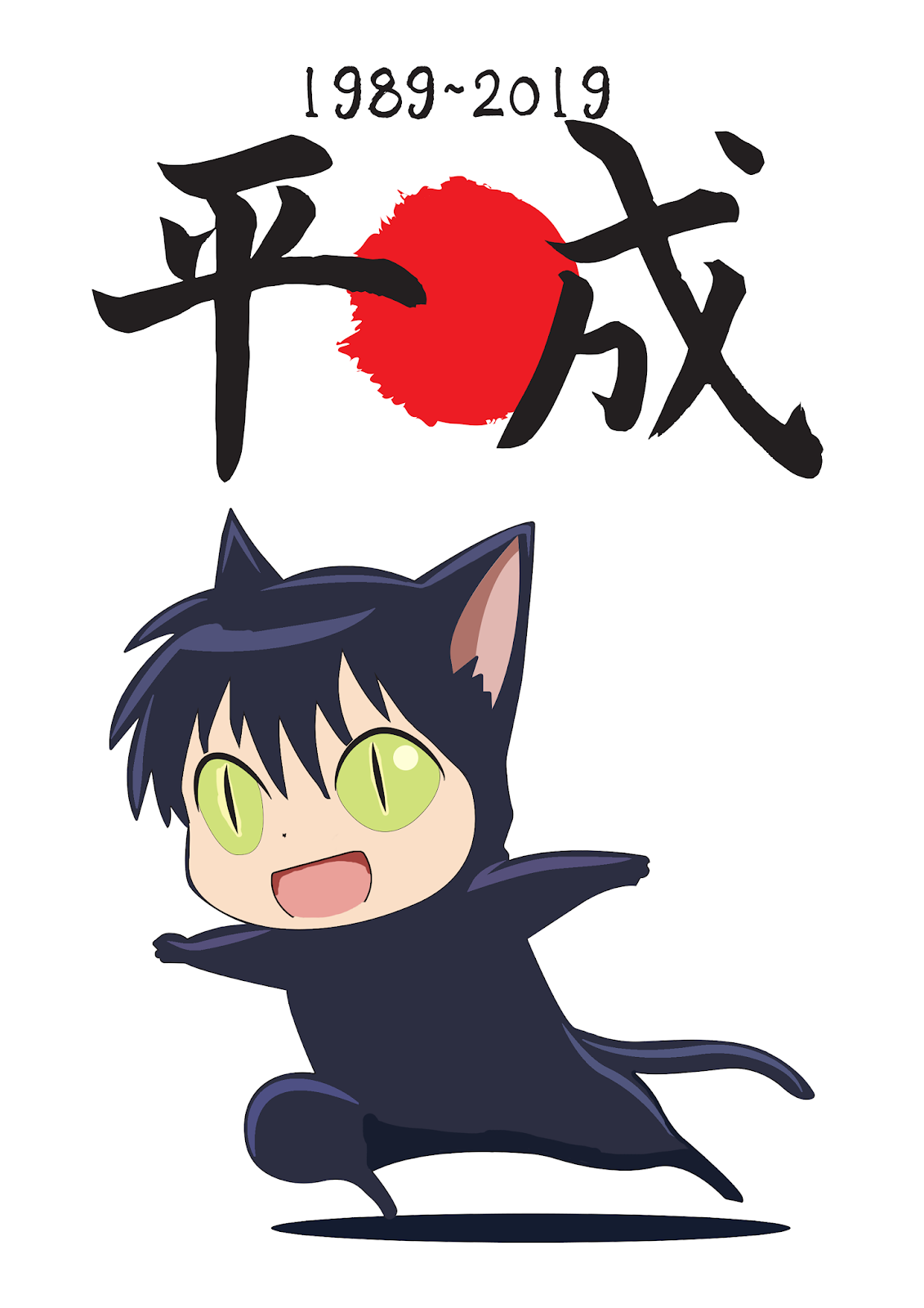
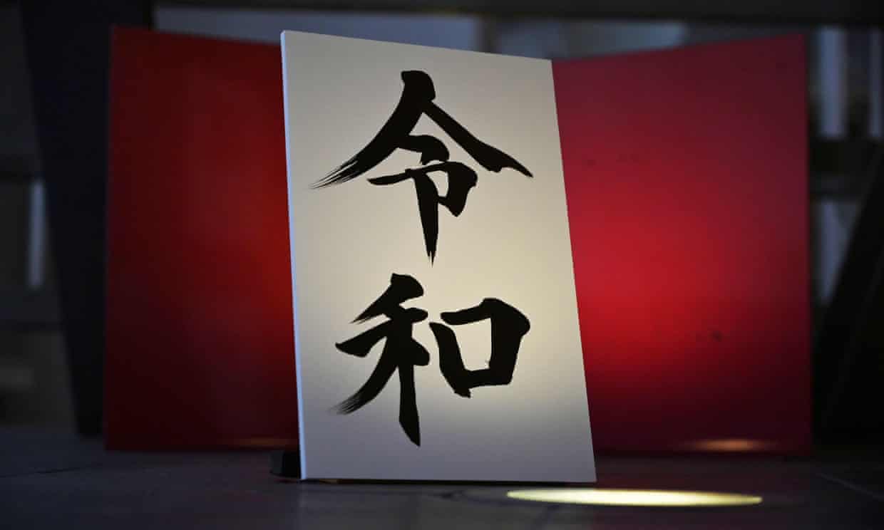
Generally, I did a lot of briefs were related to the Japanese culture which exactly fit my interest. The most unforgettable brief from this module is the "Sakura Festival in Leeds" as it is one of the biggest events in Leeds in June organized by a group of Japanese students from University of Leeds. I am really happy and glad to work for the organization as this was my first time to work for an organization instead of individual clients. I felt more challenging than working for individual clients because the design has to fit what everyone in the group wants but not only a single individual.
Luckily, all of the members appreciate what I have produced so it made me feel more comfortable. During the brief, I learned a lot of Japanese culture for example what is "Sakura", which I am happy with. I remember at the initial stage of this brief, I had a meeting with the members of the organization to explain my ideas and plan which was found to be really useful in the further development because I could know exactly what the organization wants in an easy way instead of just communicating through the social media. Hence, I think if I have a chance to work for any clients, I prefer having a face to face meeting at the beginning to understand the precise requirements and avoid making any mistakes.

Due to the fact that the weighting of the module is the highest(60credits), therefore, I spent most of my time working on this brief. The time planning and management of this brief I think was quite good because I have enough time to complete this brief. I remember during the first semester, most of our classmates including me were only focused on the COP3 project as it had to be submitted by the Christmas so I was really stressful at that time because I was wondering if I could finish this module by the deadline or not. Luckily, in January, I started to push myself working on this module everyday so I am able to finish this module. I set a target for myself which I need to do at least a blog post and development every day, and it was quite successful so I am really happy with that.

I think the room for improvement is to try more on hand process development because usually I just developed quickly with the hand process and stayed with the digital development. Hence, I really need to do more on the hand process.

Most of the briefs that I did from this module were focused on branding/campaign designs which fit to what I like the most in graphic design, I am sure this is a great chance for me to improve, develop my specific skill in this area so that it can benefit to my future career.

Overall, I really like what I have produced on this brief even though some of the briefs only short and quick briefs but generally everything that I designed was indeed what I wanted to achieve. This module is really helpful to significantly improve ourselves in the design industry. 

Thursday 11 April 2019

Evaluation

This is my last project out of 10 and it is a short brief only so I just spent about a few days to complete everything, I feel really happy that I can create something to celebrate the Japanese anime over the Heisei period, as a huge Japanese anime fans, I really want to say thank you to the Japanese anime industry what they did over the Heisei period which makes my child life or even now become more interesting because if the anime/manga. Hence, I feel happy to use my ability to design something to express my feeling.

I quite like the outcome especially the calligraphy typeface, it fully showed the beauty of kanji(Chinese characters). It was fun to take different things that I did or learned from other modules or briefs and combine and use them into this brief, it is exactly what we want to achieve.

If I have more time, I would like to design more things instead of posters, such as card games because it would be a more interesting way to celebrate the event.


Final designs


Each poster worked quite well and linked to each other, that's exactly what I wanted.


Displaying the poster in Akihabara is the best way to show my design because it is a place where many shops and establishments devoted to anime and manga are now dispersed among the electronic stores in the district. Hence, there are a lot of Japanese anime fans so it is a good way to celebrate with all of them.

Idea development

Due to the fact that this is my quickest brief so simply, I just wanted to keep everything be simple. I planned to mainly target to Japanese residents, for example, displaying the posters in Tokyo city. The kanji(Chinese characters) of Heisei is "平成", while Reiwa is "令和". Therefore, I tried to use it as the starting point.


I tried some typeface to show the characters "平成" and "令和", however, I don't really like them because they look too common. Hence, I looked back to my COP research that what categories I can try to work with traditional Chinese characters, I decided to work with Classical Chinese characters/calligraphy because of the traditional beauty of the calligraphy, it makes the character looks more familiar and more legible. It fully shows the beauty of kanji so I think it will be really good to use on a celebration poster.


I came out with a wonderful Japanese typeface which is "nagayama_kai Regular", it looks similar to
calligraphy because of the brush strokes which is really representative of Japanese culture.


I just use a few colours on the poster (white, black and red) to keep the simple style. Simply, I just added the year to begin of Heisei and the end of the year of Heisei at the middle with the text"anime". While the red circle behind is representing Japan's flag, I made it more like a brush draw instead of perfectly rounded so that it makes a connection to the character"平成". I made the same version of the poster for welcoming Reiwa. Generally, the colour worked really well together, it created a strong contrast to show "平成" and "令和".

Due to the fact that I think this brief is quite similar to the "micro-genre of music" brief that I did in last year as I also did the Japanese anime music, hence, I think both briefs have similar point. I looked at the things that I did from last year and tried to mix them to work together.


I used the characters that I drew before and applied it into the posters so it makes more related to the theme. As I didn't want to make too different to the previous posters so I kept the same structure, however, I tried to work with the black background but it doesn't result good so I just changed to white which is a lot better.


Akihabara

Akihabara (秋葉原), also called Akiba after a former local shrine, is a district in central Tokyo that is famous for its many electronics shops. In more recent years, Akihabara has gained recognition as the centre of Japan's otaku (diehard fan of anime) culture.

Akihabara has been undergoing major redevelopment over the years, including the renovation and expansion of Akihabara Station and the construction of new buildings in its proximity. Among these newly opened buildings were a huge Yodobashi electronics store and the Akihabara Crossfield, a business complex with the aim of promoting Akihabara as a centre for global electronics technology and trade.


Wednesday 10 April 2019

Initial Ideas

  1. Photobook: Collect a range of Heisei anime/manga characters and create a simple publication to show the characters, basically it is for people to keep it as a memory. Sometime, I may forget some anime characters because there are too many, therefore, this book can remind viewers.
  2. Some posters: Design some simple posters to celebrate the Heisei period and welcoming the Reiwa period coming.
  3. Bookmark: Design a range of bookmark that using different parts from different Heisei anime characters and allows users to use and play a mini-game, they can rearrange a unique character by mixing different parts from different characters.
At last, I came out with the idea that producing some posters because I think it is the best way to celebrate and welcome the previous era and the new coming era with more people as basically, the posters can show in everywhere which is the easiest way to show to people.

Heisei anime/manga

In this era, we have enjoyed a lot of Jump animation. Goo Ranking, Japanese anime-media site ask their readers to choose the best Jump anime from Heisei Era.

One Piece is the winner, this is the story about the adventures of Monkey D. Luffy, a boy whose body gained the properties of rubber after unintentionally eating a Devil Fruit. With his crew of pirates, he explores the Grand Line in search of the world's ultimate treasure known as "One Piece" in order to become the next Pirate King.


The ranking:
1. ONE PIECE - 1031 votes
2. NARUTO - 620
3. Dragon Ball Z - 575
4. Slam Dunk - 571
5. Yu Yu Hakusho - 555
6. Haikyu!! - 495
7. Gintama - 418
8. Kochikame - 406
9. Bleach - 168
10. The Prince of Tennis - 158
11. Kuroko no Basket - 147
12. Death Note - 142
13. Katekyo Hitman Reborn! - 137
14. Dragon Quest: Adventure of Dai - 132
15. Yu Gi Oh! - 127
16. Beelzebub - 122
17. Ninku - 118
18. World Trigger - 113
19. Green Makibao - 110
20. Tales of Puppetmaster Sakon - 105

Apart from this ranking, I also know a lot of famous anime/manga that released in the Heisei period, such as:

1: Attack on Titan(進撃の巨人)

2:Sailor Moon(美少女戦士セーラームーン)

3:Kamen Rider Ryuki(仮面ライダー龍騎)

There is still a lot of popular Heisei anime/manga, it is true that Heisei is a period to make Japanese anime/manga become a success over the world.

Heisei period

Heisei period, in Japan, an imperial reign period that began in 1989 when Akihito became emperor on the death of his father, Hirohito (the Shōwa emperor). The two Chinese characters (kanji) constituting the period’s name are translated, respectively, as “peace” and as the root of the verb “to become.” An English equivalent for Heisei is “Achieving Peace.” Heisei 1 (平成元年 Heisei gannen, gannen means "the first year") started from 8 January, 1989. The Heisei period will likely end on 30 April 2019 (Heisei 31).


The new Japanese era name

Japan has revealed the name of its next imperial era to be "Reiwa," from "Heisei" and set to begin May 1, 2019 which marking the end of Heisei period. The year 2019 corresponds to Heisei 31 until 30 April.

The Japanese Foreign Ministry provided an English-language interpretation of Reiwa as "beautiful harmony", to dispel reports that "Rei" (令) translated as "command" or "order".  It is a natural moment to look back at the era past and forward to the era ahead. Japan can regard Heisei with pride, and Reiwa with hope.

Reiwa writing in kanji(Chinese characters)

What is Japanese era name

Japan counts years using a system of era names. The current era is Heisei, which began when Emperor Akihito(the current Emperor of Japan) succeeded his father in 1989. A new era will begin when his heir takes the throne.

The Japanese era name (年号 nengō, "year name"), also known as gengō (元号), is the first of the two elements that identify years in the Japanese era calendar scheme. The second element, a number, indicates the year number within the era (with the first year being "Gan (元)"). The third (and final) part is the literal "nen (年)" meaning "year."

In East Asia, countries that were vassals of China traditionally used Chinese era names to number their years, and if a country used its own year-numbering system, that indicated its non-vassal status.  There were also cases where countries followed the Chinese system for external purposes but used their own calendars domestically.

In pre-modern Japan, a new era name was sometimes adopted to mark the accession of a new emperor, but it was also common to change the gengō on other occasions, such as in the wake of a natural disaster. A single era could include parts of the reigns of two emperors, such as the Keiō era, which started in 1865 under Emperor Kōmei and ended in 1868, during the reign of Emperor Meiji.


Japanese era name brief celebration intro

I decided this is the last short brief out of 10 briefs, it will be just around two or three days.

Recently, I read the news about Japan is going to change the Japanese era name from Heisei period to Reiwa period on the first of May, 2019. Over the "Heisei period", as Japanese anime fans, I watched a lot of anime/manga. Therefore, I want to create something to celebrate the success of Japanese anime/manga over the Heisei period, at the same time, I can keep a record and memory of it and welcome to the new period coming.

Evaluation

This is one of the quicker briefs from my 10 projects, it was an amazing project because I wanted to do a rebrand for a British brand by using traditional Chinese characters special structures in the COP practical project, however, I didn't have enough time to complete it on COP. Therefore, I took it to one of my briefs in my extended practice. It was great to make a translated version of a brand's logo instead of English, especially using traditional Chinese characters as it has a lot of special structures which is helpful to rebrand a logo from another alphabet/western languages. Overall, I really like the outcomes, they look simple and clean so that it keeps the original logo style. This gives me a good sense that working with geometric shapes on traditional Chinese characters usually work the best if it is a simple design, hence, I can try more on it if I have a chance to design a logo using traditional Chinese characters that looks simple.

Wednesday 3 April 2019

Logo mock-up


Colour consideration&Final design

I selected four colours that I think represent Marks & Spencer the most. Simply, it can be changed according to the background colour or package. I personally like the "green yellow" the most (the second from left) because the translated logo worked the best with that colour especially when putting the English logo on the top. Moreover, it looks really nature and environmental friendly.


Idea development

Due to the fact that the Blackletter idea doesn't work at all so I changed my plan to just focus on thin and clean strokes with some geometric shapes so that it looks similar to the English version.

I looked at few Chinese character typeface that I think is similar to the original logo/San-serif typeface/ serif typeface for example "Adobe 明體 Std L", "蘋方-繁", "宋体-繁", etc. The characteristics of these typefaces are quite similar.


I came out with the typeface called "小塚ゴシック Pr6N" because it looks the best at all and matches with the English logo very well. However, I didn't like some of the strokes on the character so I did a minor change in order to make it looks better.


The parts that I used the red pen to the circle were the parts that I didn't like it, I cut that off to make it looks more nature/geometric which match more to the English one.


Furthermore, on the first character, the bottom part, I used rectangle rather than the slightly bent strokes. It was because it makes more connection to the upper part of the character. As a result, it looks like the picture below.


The left one is the unmodified typeface and the right one is the modified typeface. I think the right one works better with the English logo.

Tuesday 2 April 2019

Blackletters idea

Due to the fact that "Marks & Spencer" is a brand that has long history, Marks & Spencer was formed in 1884 when Michael Marks, a Polish refugee opened a market stall in Leeds, with the slogan ‘don’t ask the price, it’s a penny’ and it developed to a large brand nowadays.

Therefore, I looked at Blackletter, it is also known as ‘Gothic’ was created during the 12th-century at a time when more and more people began to read and write. The demand for books was increasing and they had to be written fast to meet that demand. This style of the typeface is recognizable by its dramatic thin and thick strokes, and in some fonts, the elaborate swirls on the series.

Because of the elaborate style, I think it could make the brand looks gorgeous. The problem is how to make traditional Chinese characters with Blackletter style.


I tried to draw the traditional Chinese characters with blackletter style, it wasn't that easy because normally, only alphabet/western languages have blackletter. Hence, I tried the things that I did from COP3 and apply in here.

Basically, I tried to make it like "Calligraphy/cursive writing style/Classical Chinese" because I think both of them have a similar structure which may be able to mix together. However, the result didn't work that good and match to the original one so I gave this idea up.

Simple description that what I have found in COP3

Since I decided to rebrand "Marks & Spencer" to a translated logo for the Hong Kong market, I looked at what I got from COP3 because it was match with what this brief required, basically how to modify traditional Chinese characters.

I selected "adjusting stroke weight", "using geometric shapes or make simplification of characters" and "Calligraphy/cursive writing style/Classical Chinese" because I think these would work the best in Chinese characters.

Adjusting stroke weight
-Adjusting different levels of stroke weight can create a strong contrast to viewers
-Also, alter the thickness of a character will still keep the shape but does not change the character a lot.
-As a result, it makes the character look more dynamic and active to customers.

Using geometric shapes or make simplification of characters
-Since traditional characters are really similar to the geometric shapes especially rectangle and triangle, designers usually use these shapes to replace the strokes of the characters rather than keeping the complex strokes.
-By reduced the complicated strokes, it can produce a simpler character on the logo.

Calligraphy/cursive writing style/Classical Chinese
-The traditional Chinese calligraphy is one of the culture of Hong Kong so some brands used it into their logo.
-The traditional Chinese calligraphy provided the tradition beauty to the logo if it used on a brand.
-So it looks more attractive to customers
-Classical Chinese is the ancient writing format of Chinese characters, it looks more like pictograms so it increased the legibility of the logo.

Initial Ideas

Looking at the English version logo, I have a simple idea, as the original logo looks simple, it is like used San-serif typeface. Therefore, I planned to follow the simple structure and try to create the translated one.

The translated name of "Marks&Spencer" in Cantonese is "馬莎". Due to the fact that the original logo looks really simple with the strokes. Hence, I want to create a new translated logo with a similar style if possible.

I tried a few possibilities that I did in my COP project at the beginning stage before I had any specific ideas (Cursive writing, geometric shapes, and stroke weight). As these three are the most common and useful that I think when writing traditional Chinese characters, people usually modified with.

Simply I worked on a grid paper roughly first so that it would make me easier to write or design the characters. Basically, I tried three possibilities on the translated characters quickly, generally, I think the one worked with geometric shape(rectangle) match with the English logo quite well. Hence, I will development more by this characteristic.


Monday 1 April 2019

Brand selection

By looking at different British brands in Hong Kong, I decided to choose "Mark & Spencer" because it is a large brand and they have a lot of stores in the Hong Kong market.


M&S is one of the UK's leading retailers. They are committed to making every moment special through the high quality, own brand food, clothing, and home products we offer in their stores and internationally.

Marks & Spencer have been delivering the best of Clothing & Home and Food around the world for over 70 years. From humble beginnings just after the Second World War when they exported to a handful of countries, they now have over 400 stores and an online presence across Europe, the Middle East and Asia and an online presence in North America, Australia & New Zealand. They operate 3 models with the majority of stores run on a franchise basis, supplemented by their owned stores & Joint Ventures in Czech, Greece & India.

There are 25 Marks&Spencer and Marks&Spencer Food stores in Hong Kong.