Saturday, 5 November 2016

More research about Clarendon and Univers

Clarendon  
The most useful fonts that a printer can have in his office are the Clarendon as they make a striking word or line either in a hand bill or title page and do not overwhelm the other lines. Clarendon was designed by Robert Besley for the Fann Street Foundry during 1845. The typeface was inspired by Antique.
Some characteristics of Clarendon
-Slab serifs
-Is bracketed serifs
-Tall X-height
-Short descenders and ascenders 
-The gentile curves connecting the serif to the body of the text.
  Becoming a popular wood type, Clarendon is also notable as a common choice on ‘Wanted’ signs of the old west.


  Remaining a popular choice for over a century, many of today’s most recognized logotypes are based on the Clarendon style. For example the logo of  "SONY".


Univers

  The typeface Univers is one of the greatest typographic achievements of the second half of the 20th century. The typeface has the advantage of having a type of weights which give an impression of stable. As the style of Univers is very clean, it makes this a legible font suitable for almost any typographic need. Univers was designed by Adrain Frutiger , in 1957. Univers is simmilar to  Helvetica  (1957) and Optima (1958). However, Helvetica had a general clarity and a modern, timeless a neutral effect without any conspicuous(contrast) attributes. While, Univers expressed a true and cool elegance, a rational competence.

  For example, this is the book cover of "Flodhesten Henry, Illustrationsforlaget".


Class Critique Response

  During the crit, my classmate suggested some symbol that represent lucky to me so I did some research with the symbol of lucky on the internet.
  1) Horseshoe: The horseshoe is one of the most well-known good luck symbols of the western world. It is believed that the horseshoe used to protect against any form of evil and bring good luck.
  2) Clover: In the early days of Ireland, the Druids believed that they could see evil spirits coming when they carried a three-leaf clover, giving them a chance to get away in time! They thought four-leaf clovers offered magical protection, and warded off bad luck.
  3) Dice and Poker: To take a chance. To risk show yourself to criticism by not following through on a task.


  After that, I started to design a letter with the horseshoe. I made the letter very bold as some of my classmates told me lucky is also representing happy so it would be quite bold. However, I am not sure the bracketed serifs using Egyptian, Antiqua or Franziska. If I use Egyptian, it is too similar to Clarendon. So I may focus with Antiqua and Franziska.


Two rationales

1) Inspired by Clarendon, Lucky is a good word in everywhere. The stroke of Clarendon contrast is slight and serifs tend to be short to medium length. Clarendon were designed as bold faces to accompany text composition. It is good for displaying . Hence, I think my idea can apply to "Casino" for example logo, poster, etc. Everyone want to be lucky in the casino so the typeface shouldn't look too formal and serious as "Lucky" is quite an active word. The curve of Clarendon font looks informal and casual. The most important thing is the curve really similar to the horse shoe. So it is good for applying to gambling place which can let people feel relax and lucky.

2) Inspired by Univers, but in this case I want the typeface appear in a formal way for example school lucky draw poster but not gambling, not casino. Univers is a classic typeface, unlike Clarendon, it is a sans serif typeface, the top or low part are plain so it looks quite formal which is good to use in school because school is a formal place which students have to follow rules.

Class Critique

  In this first class critique, I showed my ideas two my classmates. And I asked two questions which will help me to develop my ideas.
  1) What do you think about the word "Lucky"
  2) Do you think Clarendon font looks more interesting than "Univers"?

 Three people said when they look at the word "Lucky", they think of the horse shoe, A leaf clover, dice and poker. They said these are the symbol of lucky. A people said I can try to do opposite but I am not really understand what's that mean. Someone suggested me can take a uniformed typeface and make it more playful. They suggested me can try to apply a sanserif font to my ideas.


  Actually we did a small activity even it is not during the class critique, I think it is also a good way to get some useful ideas. The task is we write our adjective and pass to others and let them just use line to describe our chosen adjective. Some people drew the clover. However, I found one really good idea, someone said "Lucky" representing super happy emoji which looks bold and smile. 
  Generally, I really like this activity, just using simple line to describe a word. For next step,I will think two ideas with my adjective. And I will look more example of Univers and Clarendon. Also I will start to sketch some ideas.

Initial Ideas

  My first idea is using Clarendon as I think Clarendon is notable for its strong horizontal connecting lines which contrast very little with the main stroke. So I traced the Clarendon typeface and tried to draw again to a paper and see which part I can change it.


  At the beginning, I drew the Clarendon typeface just the outline because I wanted to see how it looks like and so that I could think which part I can do kerning easily.
  My second idea is using Univers, it became the most used sans serif face. I traced it and drew a simple idea by using Univers. However, I prefer Clarendon more than Univers as I think Univers doesn't match with my adjective because the typeface of Univers looks too straight and quite boring.
Compare with Univers, I think Clarendon make me feel more interesting, it has strong bracketed serifs which I really like that.


  I made some really simple ideas by using Clarendon and Univers with upper case or lower case. I think those with Univers can be just use at formal way for example "School Lucky Draw". However, I think for Clarendon, it can be apply in different way including some gambling place(casino). So I will focus more in Clarendon.

Thursday, 3 November 2016

Typeface research

Garamond
-Garamond typefaces offer elegance and readability, making them suitable for a wide range of applications.
-This font has been expanded to include small caps, titling caps, expert fonts, and swash caps, which were typical in the fifteenth and sixteenth centuries.
-Garamond was the first to craft letters to the medium. 

Caslon
-Caslon is an Old Style serif typeface originally designed by William Caslon in 1722.
-The 'A' has a concave hollow at top left, the 'G' is without a downwards-pointing spur at bottom right and the sides of the 'M' are straight.
-Caslon is a good font for body text. It usually use in magazines, journals, books or as a corporate typeface.

Baskerville
-Baskerville increased the contrast between thick and thin strokes
-The curved strokes are more circular in shape, and the characters became more regular.

Bondoni
-The square dot over the letter “i”, and a double storey “a”.
-The capital “Q’s” tail is centered under the figure, and the uppercase “J” has a slight hook.
-Mainly used for displays, posters, headlines and logos; especially in the fashion scene.

Clarendon 
-The classical Clarendon form originating in England in 1845 as polished by Edouard Hoffmann and Hermann Eidenbenz at Haas a little over a century later.
-Has strong squared serifs but with an added softness from the curved brackets and has a low contrast

Berthold
-A sans-serif typeface designed by Hermann Hoffmann in 1908.
-The typeface has rounded corners and extremely short descenders giving it its characteristic “blocky” feel.
-Block Berthold is available in three weights—regular, bold and heavy

Times
-Very common in book and general printing
-Through distribution with Microsoft products and as a standard computer font, it has become one of the most widely used typefaces in history
-Tiny lines that attach themselves to the end of a stroke in a letter 

Helvetica
-modern, innovative and clean style
-Helvetica’s characters always have horizontal or vertical stroke
endings
-Fantastic use of white space between characters. 

Univers
-Univers is the name of a sans-serif typeface designed by Adrian Frutiger in 1954. Classified as a neo-grotesque typeface 
-Released in 1957
-Similar to Helvetica, however Univers contains an absolutely huge variety of weights and widths, making it a much more flexible type family than Helvetica.


So, I typed the word "Lucky" in different typeface see how they look like.

Wednesday, 2 November 2016

Chosen Adejctive

Chosen adjective


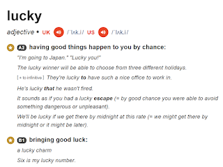
  I have chosen "Lucky" be my adjective for studio brief 2 because I want to pick a simple adjective but people always use it. "Lucky" is really a simple adjective and people always said "I want to be lucky" etc. It would be very fun to make my typeface looks lucky, I designed to make the display typeface for posters or logo because when I hear the word lucky, I think of lucky draw or casino so I to make my typeface won't look too boring.