Wednesday, 26 October 2016

Final outcome/Brief summary and evaluation

26/10/2016
 Final outcome

  In studio brief 1, I created different outcome. The word that I got is "DingDong". As it is a sound so I designed my company to be a communication app company. My target audience is general public but mainly focus on teenagers because they will be the major group of people to use the app as they always chat with others. Therefore, the main function of the app is chatting with people. I want my market be international so the app is free to download from AppStore or Google play. As "DingDong" sound quite active so I don't want the app only can chat, the app will do some corporation with different companies and release some emotions which users can buy or try it on the "DingDong Store". After that users can use during their chat.


This is the interface of the chatting room of the app.

For example, my company will do a corporation with many companies to release some emotions such as Disney or DreamWorksAnimation, etc.


This is an example when people using those emotions in the chat.


  In this studio brief, I think it is really excited because we were given a word that we didn’t know before and have to make a design based on that word. Luckily my word isn’t too difficult. This is my first studio brief over the course so I felt quite nervous at the beginning because I was scared if I did everything right. I was confused whether we have to rebrand for a company or design our own company at the very beginning. But after I fully understand the brief, I found it is very fun to design a logotype for our own company. Generally in this brief, I really like the productions it looks better than what I thought so I am proud of myself about that. In the final crit, I displayed my outcomes to my classmate and they said they feel really friendly when they looked at the logo, the gradient colour match with the letterform with white colour. However, they said I can think about what functions does the app exactly have because I didn't think about that when I working on my project. For example, Instagram mainly for users upload or view photos and videos. While, messenger mainly for users chat with people. So I need to think about it in the future tasks that are similar to this. Overall, I think I learned a lot of skills in this brief for example kerning, critical analysis etc. It is really a good starting exercise and chance to improve my knowledges in this course. 

MK Gallery

21/10/2016
 MK Gallery

  During the autumn in 2009, the review of the MK Gallery's brand and marketing activity led to increased the investment in digital communications. They renamed the gallery from Milton Keynes Gallery to MK Gallery. And then, they made the new logo, joined the letter "M" and "K" together and formed a single word. Also, they used six different system fonts on both Apple and PC.


   I really like the Helvetica style font, specially the one in bold. It looks most attractive. Moreover, when we refresh the page, the colour change automatically, it looks really amazing. It makes people feel interesting so they may go to the gallery.
    For the word, they joined the "M" and "K" together, I think it is really easy to understand the word"MK". I guess the reason that they only did kerning on "M" and "K" is because their original name was Milton Keynes Gallery. After they renamed, it is "MK gallery" the word that changed is Milton Keynes so it can show to people where they changed easily.


Tuesday, 25 October 2016

Evaluation after the final crit

25/10/2016
Evaluation after the final crit

  During the final crit, I showed six of my designs to my class and narrowed down to my favourite one.

  My class said this logo really feel friendly when they looked at it, the gradient colour match with the letterform with white colour. However, they said I can think about what functions does the app exactly have because I didn't think about that when I working on my project. For example, Instagram mainly for users upload or view photos and videos. While, messenger mainly for users chat with people. Therefore, they suggested me that to make the app able to competing with other social apps, I have to think about that. 
  Generally, I think I learned a lot of skills in this brief for example kerning, critical analysis etc. It is really a good starting exercise and chance to improve my knowledges in this course. 

Saturday, 22 October 2016

Further development with the logo

21/10/2016

  After I designed the logo, I made somethings to display my logo.


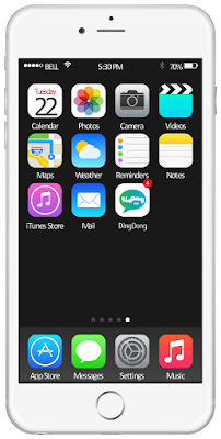
    First, I made a iphone6 homepage to display my logo, it seems people download the app to their iphone.


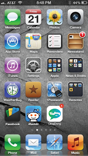
   Also, I made the homepage of Android 5.1 with the app "DingDong"


   I made the interface of Windows and Mac with my logo. The reason that I made different interface is because I want my company can be use in different platform such as Mac OS and WindowsPC. 


  Also, because mine is a communication so there should have some platform to promote my app. Hence, I will put my app in Google Play store and App Store and let people download. I designed the price be free because I want every people can use it. To earn money from the app, I thought the company can design some emotion or electric sticker and let the users decide whether buy or not. 


  This is a technology magazine "PC World", I want to introduce the app to more people so I think a technology magazine is the best way to do it.

Logo development

20/10/2016
  Logo development


As I got some feedbacks from my class said that in my previous design, the "gd" part looks confuse because when they saw it in the first time, they thought it is "DingPong"


  So, I changed the design, I moved slightly closer between each letter so that it looks more friendly at the same time, it can let users feel "get closer with their friends". I joined the other letterform other than "g" and "d". I joined "i" and "n" and I think it is better than "g"and "d" because I can see they are "i" and "n" easily, it wont confuse with other words. Also, I tried to join "o" and the second "n" together. However, it failed because I couldn't see "on" easily and I thought it looks like "a" more than "on". Hence, I just joined the "i" and "n" together.


  I tried to make different letterform but the one that I like the most is the one that I boxed, I like that because it is really easy to read the word "DingDong" compare with the others. The reason that I made both "D" as upper case is because if I made it in lower case, it looks like a fast food company more than a communication app company. Hence, I just made both "d" with upper case. I tried to make all letters with upper case, however, the outcome looks like a hotel logo so I just made both letter "d" with upper case and it looks like a communication app more.

I tried to make both "d" as lower case.
  I did some research on the internet and I found most communication apps just use a symbol to represent their company. So, I made some symbol in illustrator which represents chatting with people.


  I drew out my ideas first on the paper and see how it looks like so that I can change some details easily.


I made different version for the logo. However, I like the third one on the top the most because it looks most attractive for me. I asked opinion from some of my classmates and they said they
the third one on the top is the best because the colour very match with the letterform, it looks friendly.


I picked six of my favourite designs


I choose this logo for my final design because it is my favourite design compare with others. I think it looks the most friendly, I can feel easy to use the app. I like this gradient colour because I mixed light green and light blue together. Actually there is a reason that I mixed this two colour. As I always see light green used in lots of communication apps such as "WhatsApp" or "Line" etc. Also it represents " Answer the call" on the phone and light blue represents refreshing and friendly. So I mixed both colour and want to tell users that the app is friendly and easy to use.

Friday, 21 October 2016

Helvetica

21/10/2016
Helvetica


  Helvetica is the most popular typeface in the world nowadays because of its modern, innovative and clean style. It has more than fifty years old, it was named as Neue Hass Grotesk before. After their name changed, the typeface took off in a big way. Helvetica's lines are simple, there are no elaborate lines or flourishes at the end of the letters or numbers. Helvetica's characters usually have vertical or horizontal terminations on their strokes. Also, the negative space surrounding the letters than about the lines that make up the characters by themselves.


  This is the logo of a Japanese company"MUJI". It used Helvetica as the typeface. We can see there is no any distracting serifs or flourishes at the start or the end of the letter. The logo used dark red. The translation of the word "Muji" in Japanese is no-brands quality goods. I guess the designer wanted make it simple and bring a message to customers that their brand is suitable for everyone even they are very rich or not. Therefore, they used Helvetica as the typeface and there is only one colour in the logo. They put the English word upper than the Japanese and even made it bigger is because they want their market become international. 


  This is the logo of the company "Panasonic". It used Helvetica as the typeface. Panasonic made their font in tiny sizes on the side of an electronic gadget. They want to create a better life and a better world for people so in their logo, other than their company name, there is a slogan "ideas for life". I think it looks more friendly to use lower case because if use upper case in here, it seems too strong. They used blue for their company name because blue represents responsibility so it looks professional and trust in here.


  This is the logo of the company "3M" which used for more than 30 years old but it still looks simple and smart. They used Helvetica as typeface . They used light red for the logo.Surround the 3M logo with adequate clear space to ensure maximum prominence and visual impact. Also, the "3" and "M" are touching with other. The top and bottom of the logo, the letter "3" and "M" are equal and the strokes are very simple. Because they are a minnesota mining manufacturing company so they produce different kind of products which seems a connection of their company so I guess this is the reason why they designed to make "3" and "M" touch together.

Thursday, 20 October 2016

Class critique

20/10/2016
 Class critique


  During the class critique, I showed this design and how did I developed it, also asked three questions to people.
1) Do you think it is easy to understand or see the word"DingDong"?
2)Do you think the colour is match with the word?
3)Do you feel friendly when you look at the design?

  Generally, people said it is easy to understand and read. They like the concept and the fluidity of the design. However they said the second "d" and "p" is quite confuse because when they first looked it, they thought the word is "DingPong" other than "DingDong' and the "gd" part looks like a upper "P" on the "D" side. Therefore, they suggested me to try to attach other letterforms together instead.
  Apart from that, they said the colour is match with the word due to the fact that the background is yellow which is bright and awake, so it represents talking. Also they said it would be better if I try to add or change another colour for the letterform other than black.
  They also said they felt friendly when they looked at the design as the colours are warm and I can try to make the yellow softer.
  In order to make my design better, I will definitely change the "gd" part as I feel confuse too with the second upper "D". Hence, I think I will try to join "i" and "n" in my next design. Also, I will try to make a gradient tone for the background as it looks more interesting. As I did some research about the rebranding of Instagram, they also added a gradient tone for the logo, users feel more friendly about that.

Wednesday, 19 October 2016

Group Crit Response

19/10/2016

  After I got many useful feedbacks from my classmates and tutors, I changed my design.


  First of all, I changed the text to black and white and started to develop my design with black and white. Because black is the easiest colour that people can see. After that, I also started to make my design as a wave by using the function in illustrator which is call "Envelope Distort" and then selected the style with "Flag". After I did this, I tried to do some kerning with some letter for example I joined "i" and "n", "g" and "d" together. I also tried to rotate some letter, however, it does't look good so I just skipped this idea. So at the end, I joined the "i" and "n", "g" and "d" together and then I put a small "TALK" under the word "Ding Dong" because it looks much better also it can let people know this is a communication app easily.

Group critique

19/10/2016
 Group critique 


  During the group critique, I got many useful feedback. They suggested me to use more colour in my design other than yellow because it is not easy to read if the text is in yellow as it is too bright. Moreover, they said I can think about the space and position of each letter, like using kern down with some letter. Then, they said I can make my design as a wave because "Ding Dong" is a sound which like a movement. At last, they said I can look more example like "WhatsApp", "Facebook" or any other communication apps how do their logo look like. As a result, it can improve my design.

Initial Ideas sketching

19/10/2
Initial Ideas sketching


  At the beginning, I typed "Ding Dong" in different typeface. Because I am doing a communication app for my design, so my target audiences are general public, but mainly focus on teenagers as they are the main customers or users in the world. So my design has to be simple, interesting and friendly so that users can feel easy to use the app. Due to this reason, I designed to use Futura as my typeface as it looks simple, all strokes in each font are made of a single line but it still interesting which can help to make users feel friendly.
 
  Therefore, I continued to develop my design with Futura. I sketched lots of ideas for example upper case, lower case, kerning, language, size of the word, wave, etc. After I did the sketching, I really like the idea that make the word like a wave because "Ding Dong" is a sound which like a movement, it will looks more interesting because each letter looks dynamic. Therefore, I will focus to develop my design with the wave or movement between each letter.


research for Colour Theory in the design

19/10/2016


Colour Theory research


  Each colour represent different things so it can affect human's feelings. For example black represent darkness or hopeless. Therefore, I looked some primary and secondary colours with their meaning and thought about how to apply in my design.
  First, Red is a hot colour, it’s associated with fire, violence, and warfare which is represent anger. However, it also represent emergency, danger and important issue for example, the traffic light so in our daily life, stop lights and signs are red, and that most warning labels are red too.
  Yellow is the brightest and the most energising among the warm colours. It represent happiness and sunshine. Bright yellow can lend a sense of happiness and cheerfulness.In some countries, yellow has different meanings. In Egypt, it represent death or mourning. While in Japan, it represents courage.
  Green is a very down to earth colour so it represents new beginnings and growth. Adding green in our design it can have a balancing and harmonising effect which is very stable.
  Blue is often means sadness in the English language. But it also represent calmness and responsibility. While, light blue can be refreshing and friendly.
  After I did this research, I can understand how to make my design looks better by using correct colours.

Tuesday, 18 October 2016

Companies/contemporary designs research

18 October 2016


  Because I am doing the communication app, so I looked at different companies how do they design with their logo by colours, letterform or spacing.


 First, I researched the logo of a communication app "Whatsapp". The letterform is a single word and follows proper capitalisation, which is "WhatsApp" not "Whats App". It mainly used bright colours, for example light green and white. I feel friendly when I look at this logo because of the warm colour, I feel I can keep in touch with my friends easily by using this app. After that, I researched to another app which is "Instagram". They finally changed their logo after six years since the app released (in 2010). The new logo was inspired by the old one, so it still remain the camera but it looks more simple and they changed the colour to gradient form which looks more attractive. 

  All communication app logo looks simple but it make us feel interesting because of the colours or the letterform. For example, "Instagram" changed the colour to gradient form in their new logo, I think it looks better than the old one because I feel more friendly and positive when I see the gradient colour. 

Given word research (DingDong)

18 October 2016


Given word: Ding Dong
Definition: -The sound of the bell
                  -The sound when you receive a message from a communication apps


 Actually, this word doesn't have any specific meaning, it is just a sound. Therefore when I got this word, I have two ideas at the beginning which are a bell company or a communication app. But I think it would be boring if I choose the bell company as nowadays, people prefer to give a call or message others before they enter to people's house. So I choose to develop "Ding Dong" with a communication app. For a communication app, it has to looks friendly so that users will free easy to use the app. To make it looks friendly, I need to make the design easy to understand and colours should focus on warm colours such as green or yellow.

Wednesday, 12 October 2016

Kerning

12/10/2016

Meaning of Kerning: Space between 2 letterform

In this task, we worked as a small team with 3~4 people, and we asked to produce a logotype with 3~5 letters by using "kerning". Our group designed to use "N", "A", "M", "E" and formed the word "Name". After that, we were give about 5 different types of companies to work within one minute for each.

1)Luxury Car Company: We made it quite simple which just have slightly space between each letter and made it looks more serious.


The first outcome

2)Basic Shopping Brand: We also made it with simple kerning, without any rotation on the word so that customers can read it easily.

The second outcome

3)Condom Company: This time, we made it quite different with those before. We designed to make each letter close to others as this time is the condom company. Hence, we made each words close together so it looks safe. Also, we rotated the letter "e" at last so it looks more interesting.

The third outcome
4)Indie Band: We gave a wide space between each letter so it looks more creative. Moreover, we reflected the letter "a" so it looks more artistic. 

The fourth outcome

5)I.T Company: We made each letter close together but not touching as we wanted to give customers a professional feeling.

The fifth outcome


Ligatures

12/10/2016


Aims: To create a ligatures from a word.


  In my group, we designed to choose "As Fuck" due to the meaning of it is so interesting, we choose this word. At the beginning, each group members sketched many ideas on the sketchbook and shared to others members. Afterward, we selected a ligature with 4 other option that we wanted to develop on them. At last, we used illustrator to make our final outcome. We agreed that the ligature shouldn't be over-elaborate so people can write it on a paper easily other than keyboard. As a result, we came up with a simple design of a ligature of the word "As Fuck".
This is our final design of the ligature.